OCHA Tea
Package Design
Brand Identity
Product Design
Project Overview
Today, tea is one of the most popular beverages consumed in the world. The commercialization of tea has caused the romance and enjoyment of the experience to be lost, shifting focus to convenience and mass-production. The world’s desire for quick and convenient tea has actually weakened the very nature of the experience. Tea is consumed hastily, and it is no longer the traditional practice that it used to be.

Design Solution
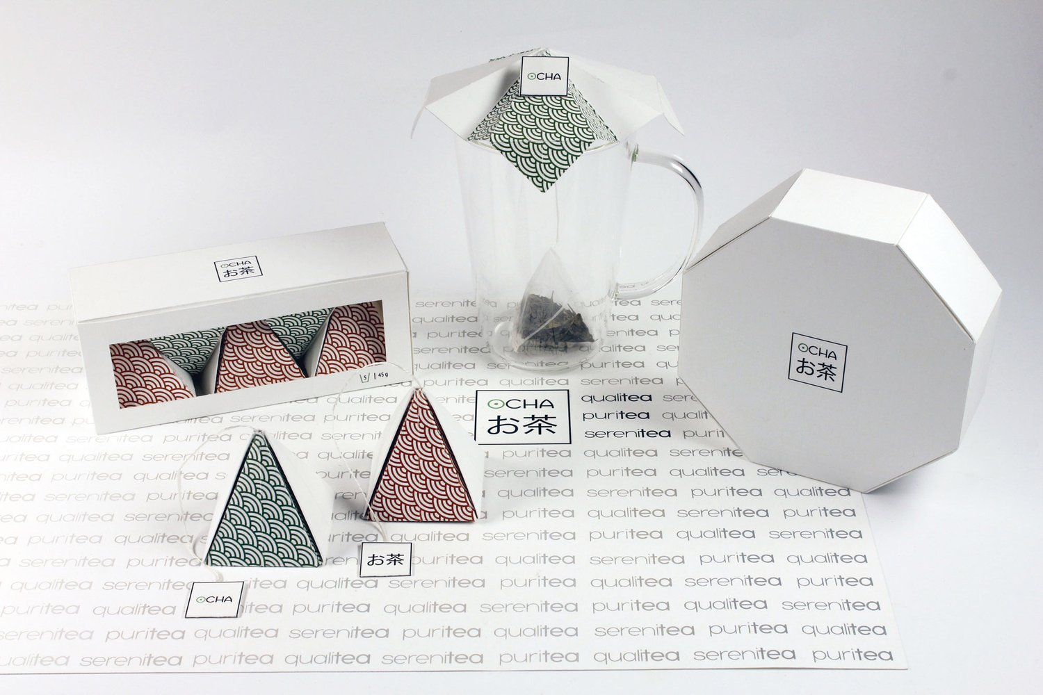
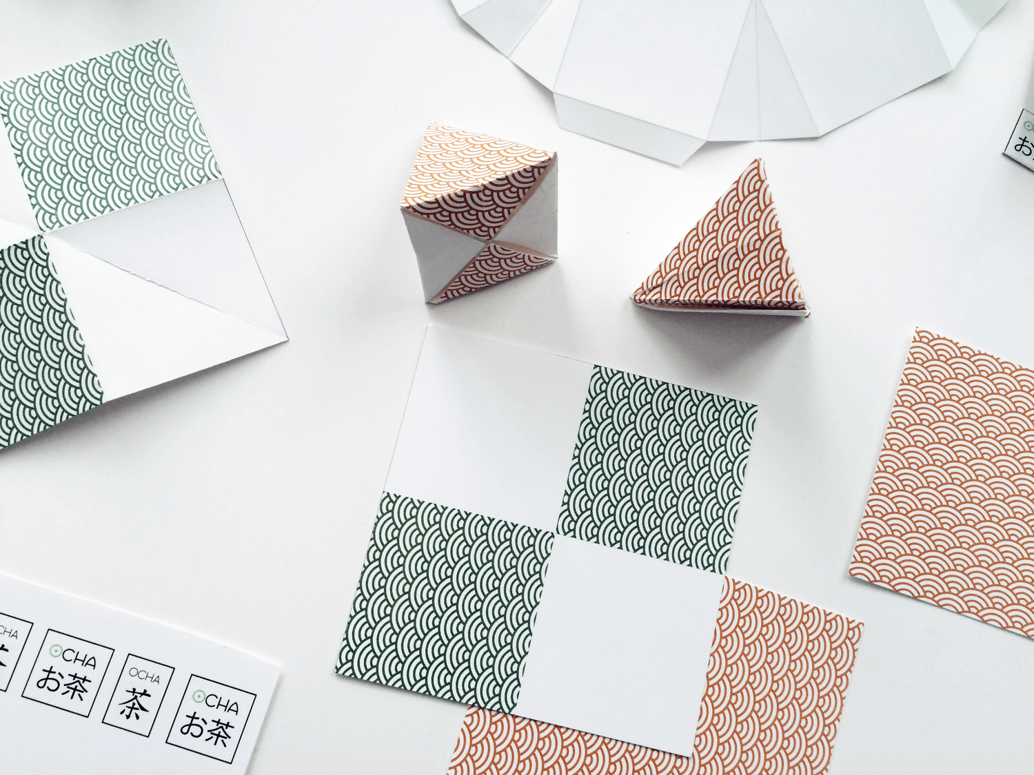
Ocha takes the conventional tea bag and uses it to create a more memorable experience for tea consumers. Based on traditional origami forms, the simplicity and unique construction of Ocha’s packaging adds unique visual interest and sets the mood for a more mindful experience: one that is simple, meditative, and relaxing. The goal is to remind consumers to take time to enjoy the little things in life.

The downsides of brewing one serving of tea in a mug (versus a whole pot) were challenged and resolved in the design of Ocha’s packaging. From a functional perspective, heat is quickly lost, and the tea is left exposed during the steeping process. The packaging targets this problem by serving multiple purposes: a protective container for individual tea bags, a lid/cover for your mug, a handle for removing the tea bag after the brewing process, and additionally, a visual stimulant to enhance the overall experience.

View the full project at www.amandapape.com/ocha-tea.