World Cup of Hockey Rebrand
Brand Identity
Communication Design
Web Design
Introduction
After a 12-year hiatus, the 2016 World Cup of Hockey (WCOH) returns as an event. According to the official WCOH website, “The 2016 World Cup of Hockey will feature eight teams competing for a best-on-best international hockey championship: The eight teams participating in the 2016 World Cup of Hockey are Team Canada, Czech Republic, Finland, Russia, Sweden, USA, Europe and North America. It is expected that more than 150 of the best players in the NHL will participate in this tournament”. This year, the main event will be hosted at the Air Canada Centre (ACC) in Toronto, Ontario, Canada. The tournament is scheduled to start on September 17 and end on October 1, 2016.
While the event is largely themed after international hockey, there are other various fan engagements available, such as The Scotiabank World Cup of Hockey Fan Village, which is hosted at The Distillery District in Toronto. The Fan Village is split up to two venues: The East Fan Village, and Distillery Fan Village. This family-friendly festival is a ten-day celebration, in contrast to the main games, which will be hosted from September 16 – 25. The festival site promises that fans, “will celebrate not only the sport of hockey but the food, music and culture of all participating hockey nations and will feature a diverse mix of programming, designed for fans of all ages…” (WCOH, 2016).
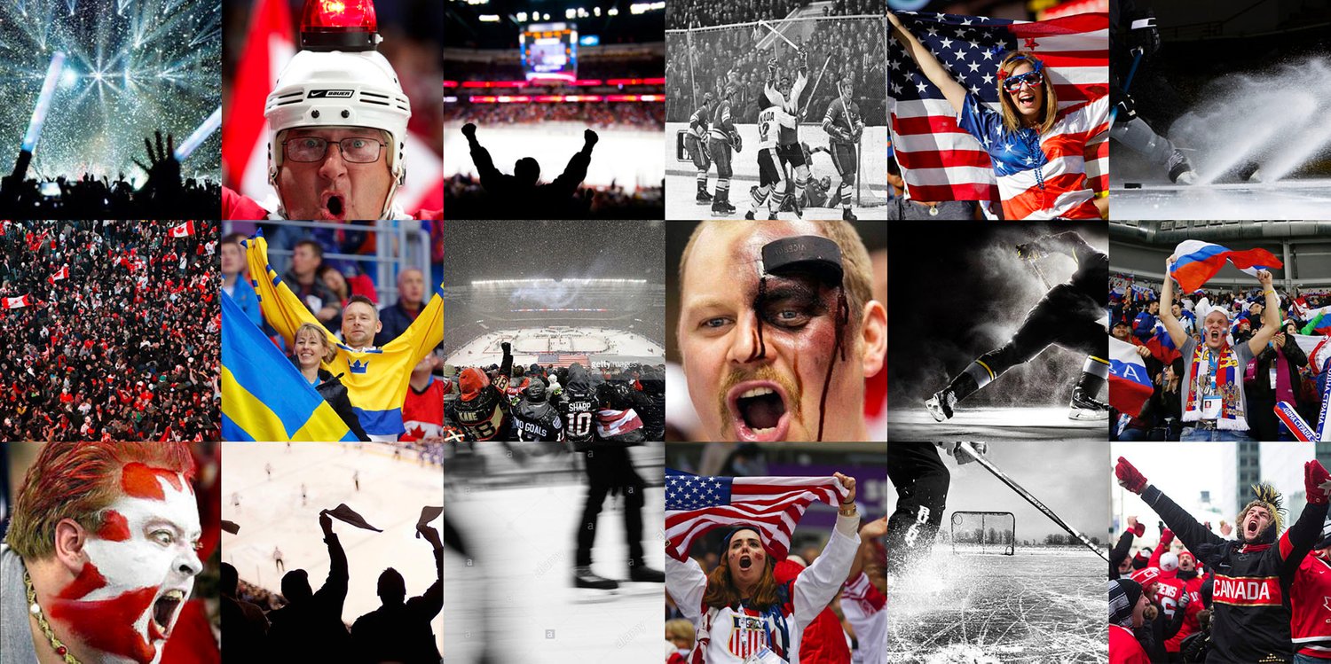
Intensity, Pride, and Passion
In the simplest terms, the purpose of WCOH is “a global celebration of hockey” (WCOH, 2016). Hockey has become an integral part of Canadian culture, with many other countries sharing this tradition. It is crucial that the design implemented will display the importance and purpose of this event. The event must showcase the importance of heritage and culture, emphasizing why hockey brings many countries together.
The redesign will also display a sense of “pride” for each team’s country, exhibiting why the sport has become so prevalent on a global scale. It will also give off a feel of “old time hockey” in order to bring the feeling of nostalgia; the objective of this is to give a sense that each country goes way back in history when it comes to hockey. However, it is important to introduce elements / colours that are intriguing to many audiences (such as being family friendly, but still appealing to single adults). These intentions can be accomplished by harmonizing elements of each team’s colours (For example, use iconic red, white, and blue for the USA, yellow and blue for Sweden, etc.), and modernizing the sense of heritage (clean, minimalistic, but does not over power the feeling of “old time hockey”).
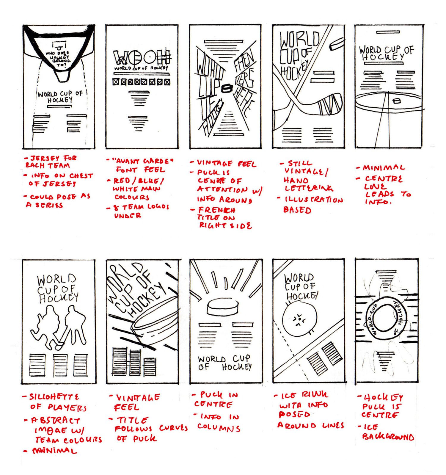
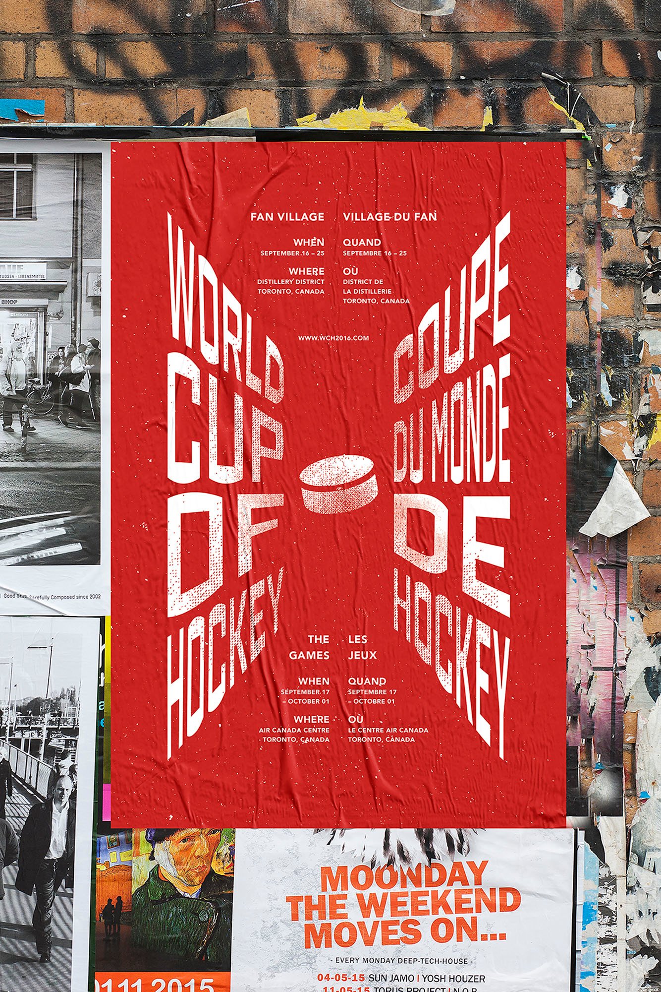
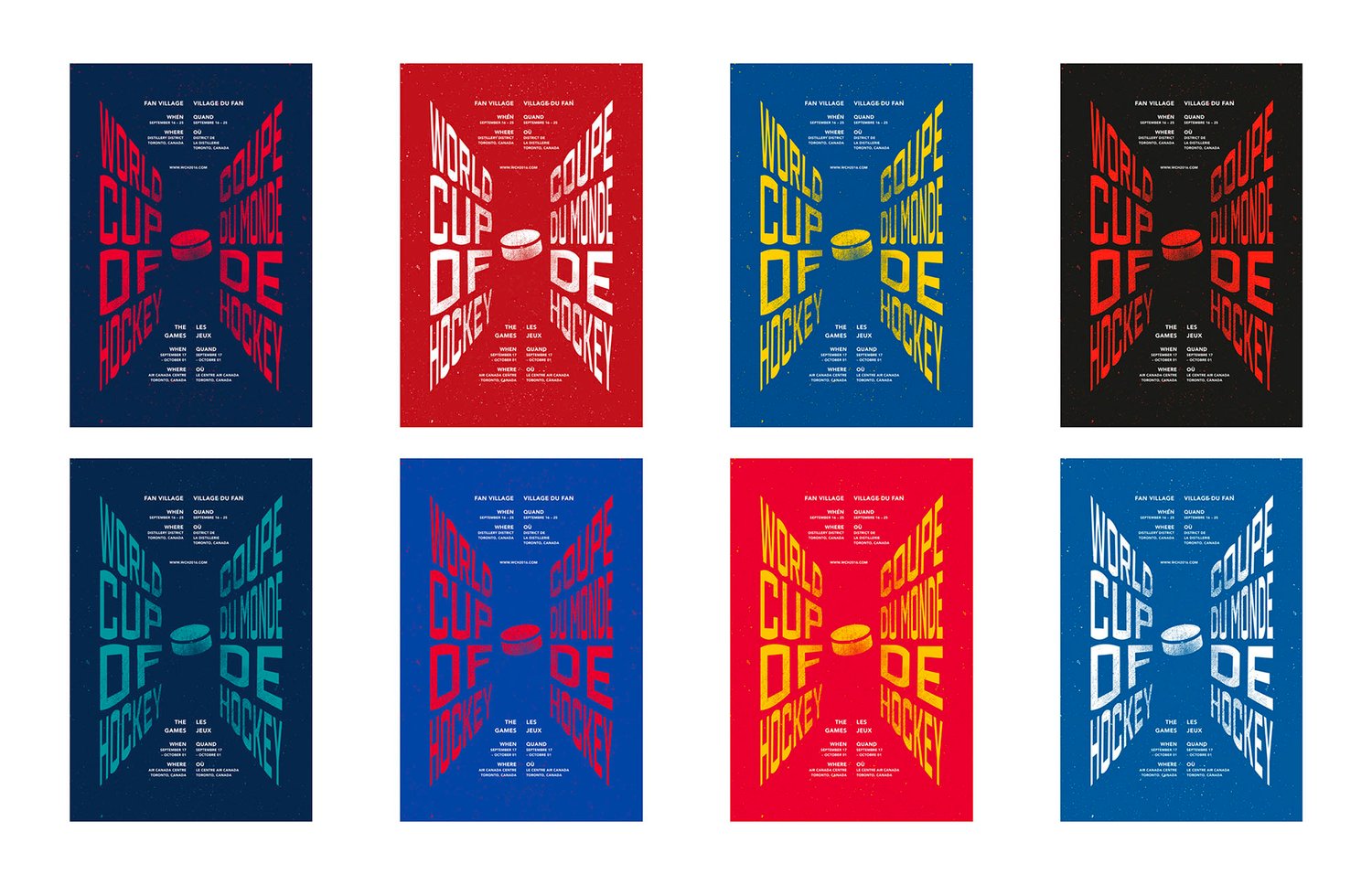
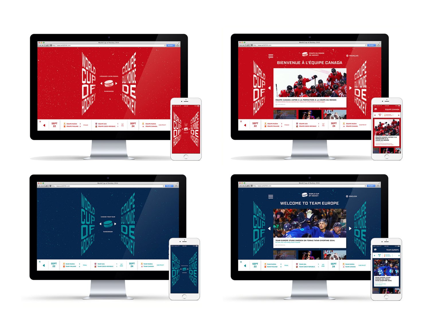
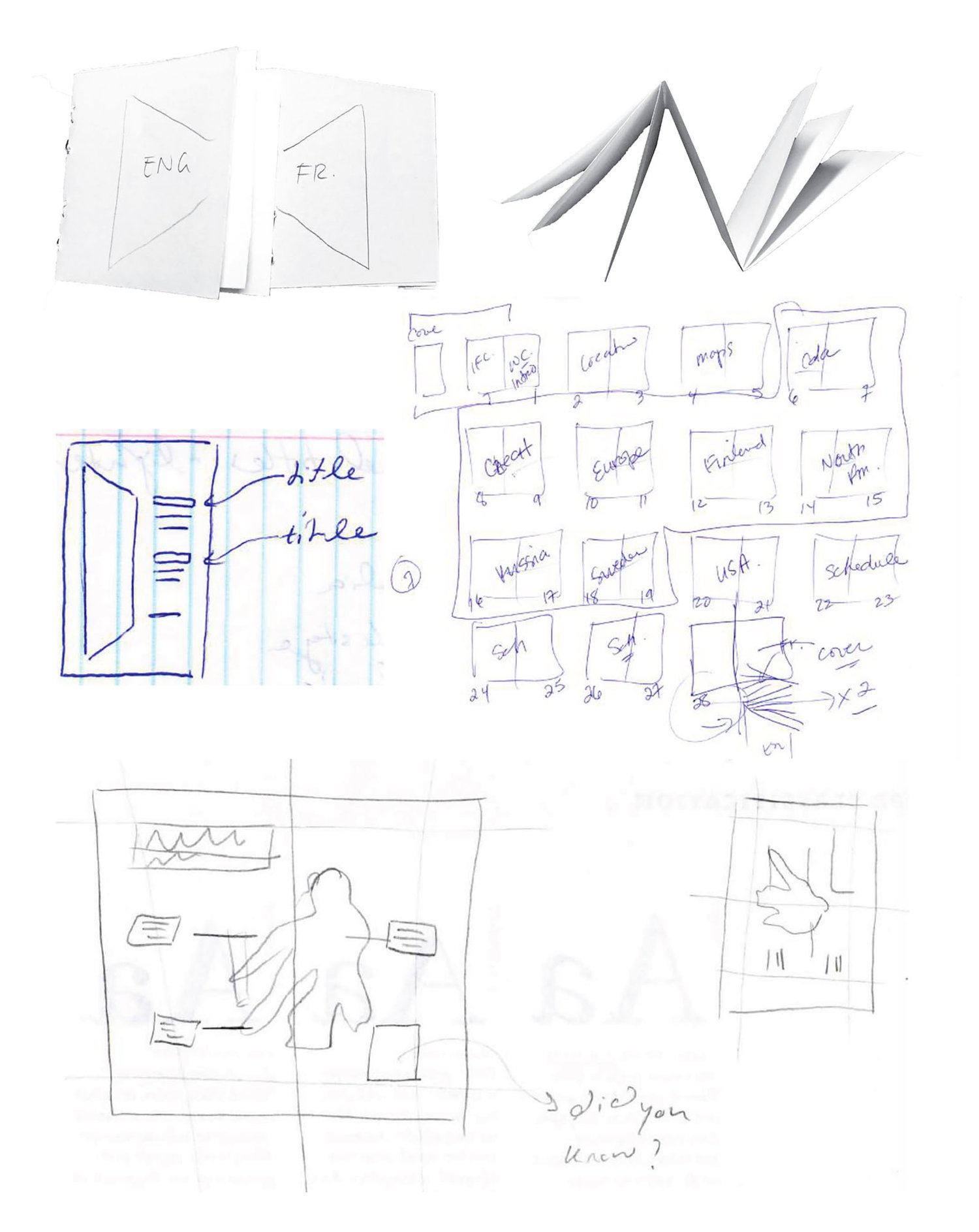
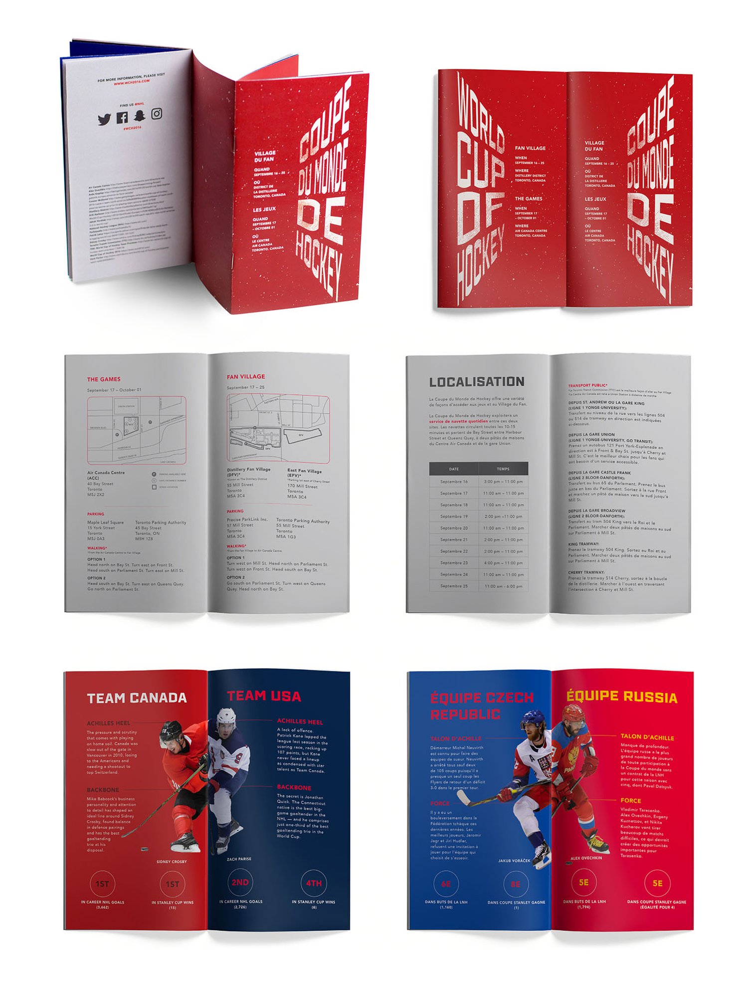
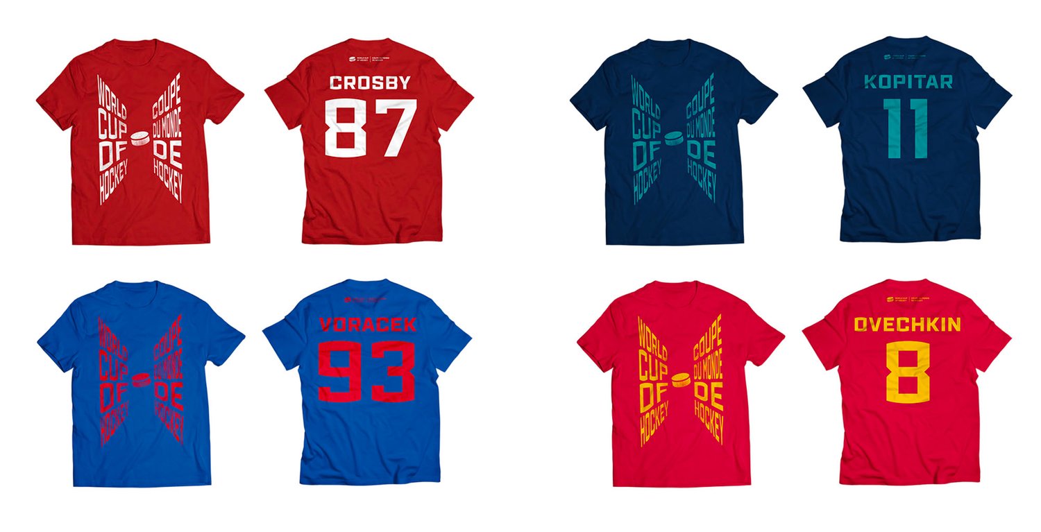
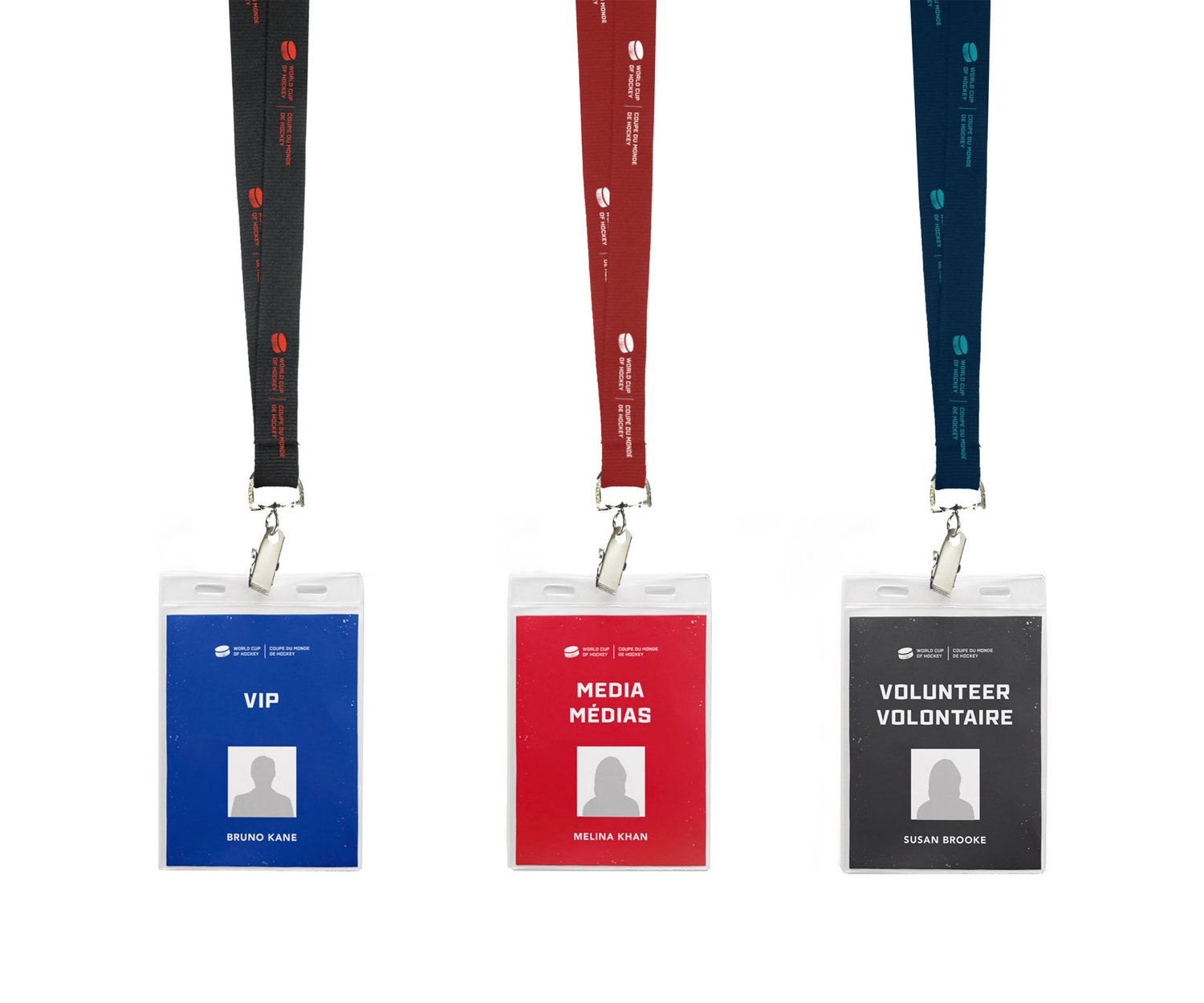
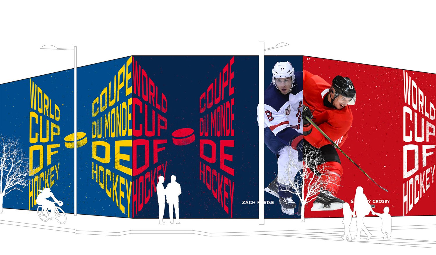
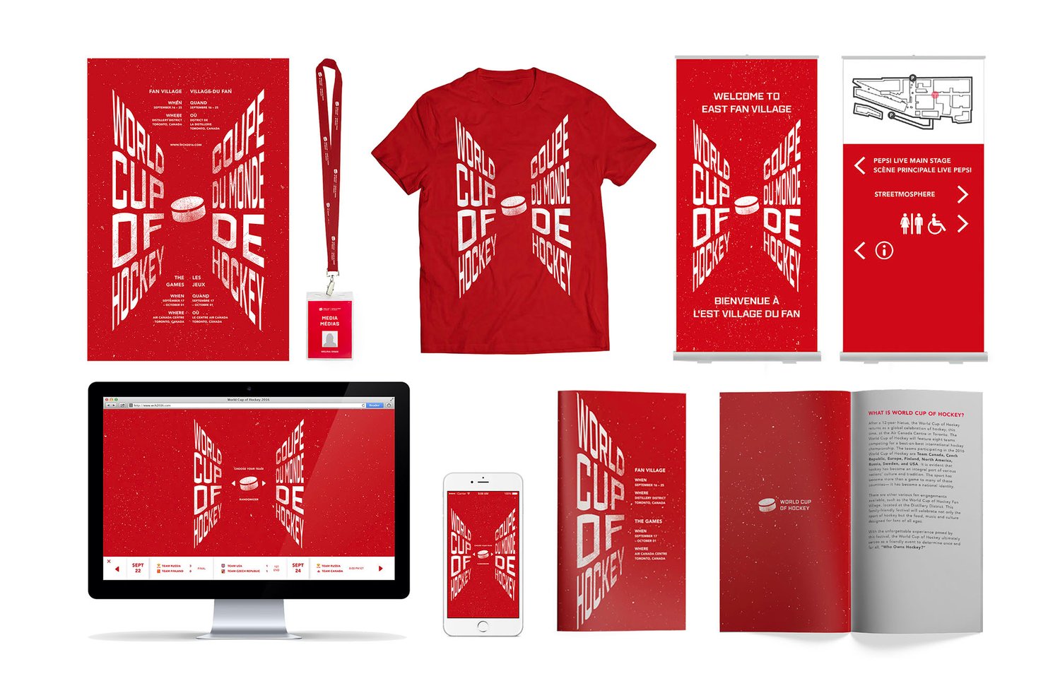
This proposed design system is for the Canadian WCOH event. In the future, if the event was to be hosted in a different country, the team colours would easily be interchanged to suit the location.