STASH Tea Packaging Re-Design
Package Design
STASH Tea - Packaging that pays tribute to it’s roots
Background
The Stash Tea Company is a privately-held company headquartered in Tigard, Oregon, a suburb of Portland. Founded in 1972 by Steven Smith, STASH transformed the nations tea-drinking habits by co-founding STASH and Tazo tea. Stash Tea is one of the largest specialty tea companies in the United States, with products available through food service, grocery stores, tea and coffee shops, club stores, mass merchandisers, natural foods stores, mail order and the Internet. Stash Tea is also available in Canada and in several other countries.
The Challenge
STASH Tea’s mission is to become the leader in creating and selling high quality specialty teas and products that enhance the tea drinking experience and continue the 5000 year old tea tradition. However, due to lack of innovation in packaging and branding, STASH Tea is falling behind. Although they have been keeping up with social media such as Instagram and revamping their website to make it more modern, their packaging lacks the appeal and is still stuck to the original package design which doesn’t stand out on shelves. Three different packages – an evolutionary, revolutionary, and transformational design – were to be created to present to a client for a revamp which encompassed the STASH brand and attracted target audience consumers.
Brand Equities

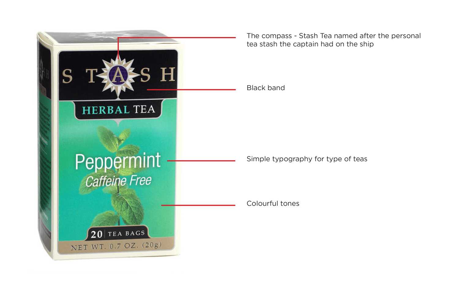
STASH Tea derives its name from an entertaining aspect of tea folklore. In earlier centuries, tea was a valuable commodity traditionally transported by clipper ship. The ship’s captain often was presented with some of the finest teas for his personal use. This supply was his “stash,” stowed carefully as his “private reserve.” Because of this, the compass is highly important to STASH Tea’s brand equities. Along with the compass, the black band, colourful tones, and simple typography all contribute to the brand character displayed.
Stash Tea’s brand character is best described as an exclusive, private collection which displays quality and tranquility.
Evolutionary Design

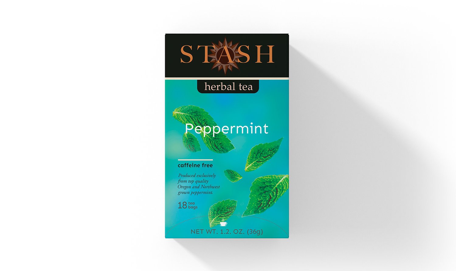
STASH Tea proclaims that they have high quality teas, however most people who have reviewed the product found it didn’t have much flavour. Because of the bright colours on the boxes of tea, consumer’s expectations of flavour for the company may be higher than others. The Evolutionary Design dulls down the colours while keeping a dreamy-like visual appearance with the floating peppermint leaves. The logo is made more coherent by changing the colours to be monochromatic and bringing in the tracking of the word “STASH”; and by decreasing the opacity of the compass and moving the compass behind the wordmark, the legibility of the logo is improved. The black band stays on the box and the remaining typography is kept relatively simple and similar to the original package, ensuring the brand is recognizable.
Revolutionary Design

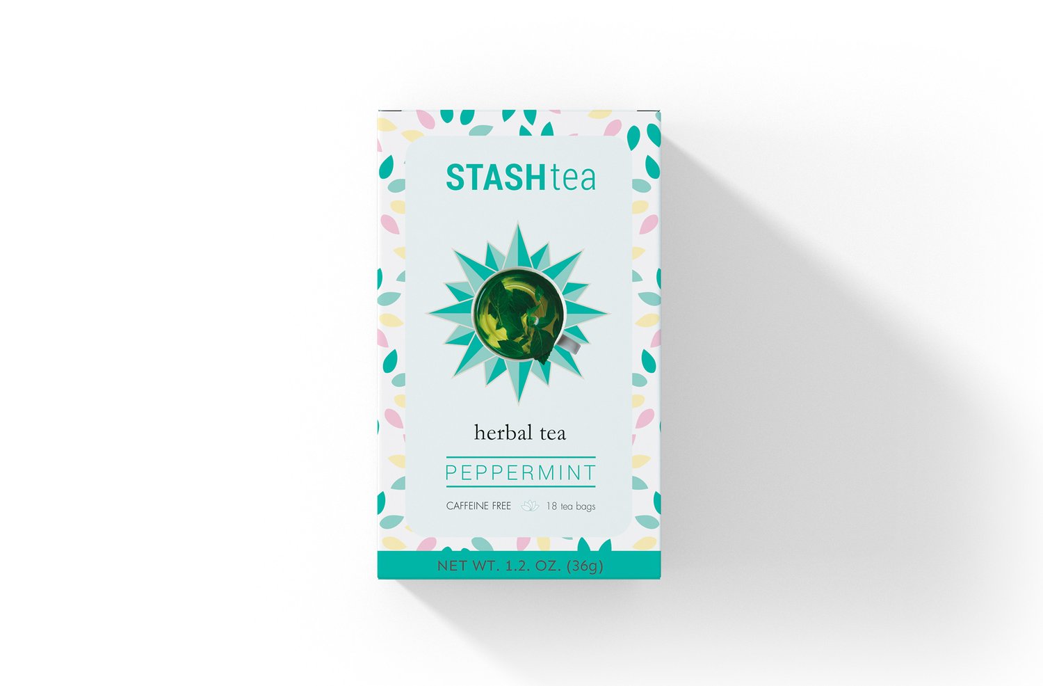
The Revolutionary Design pushes further away from the original design while still staying true to some STASH Tea’s brand equities. A more playful and clean design is created which uses a white background with multiple coloured decals to represent a type of tea. By removing the compass from the logo and using it as a coaster for the tea cup, it becomes a supporting visual component rather than an unwanted logo element, which also showcases what the tea looks like after being brewed. By changing the name of “STASH” to “STASH Tea” and converting to a sans serif typeface, the wordmark becomes more clear and concise, overall improving readability and legibility.
Transformational Design

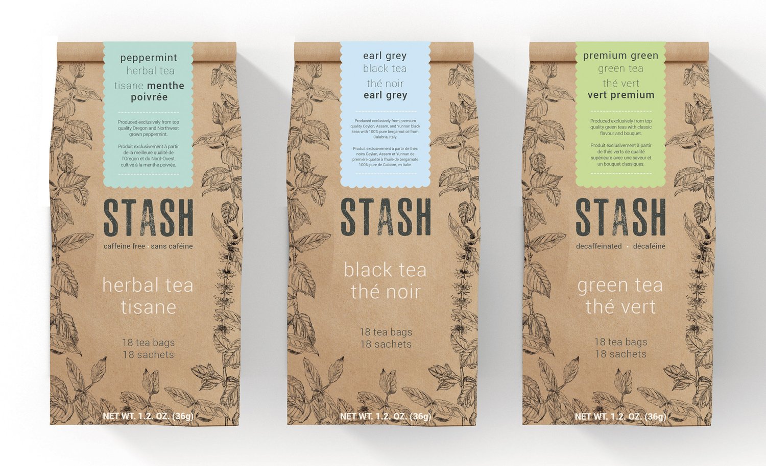
While staying true to the meaning behind the name of the company, The Transformational Design creates a different take on the traditional tea box. In earlier centuries, when transporting tea, the ship’s captain would be presented with a “stash” of tea for his own personal use. I interpreted this as a paper bag full of tea. This design plays on the more natural and authentic side of STASH Tea, using illustrations of plants used in teas as a border to the typography in the center; and using a stamp-like typeface to represent the craft of the STASH company. This redesign strategy allows for easy reproduction by using a bold coloured sticker to distinguish flavours of tea within the types of tea offered (ie. herbal, black, green tea, etc). This design is simple, tasteful, and contains a pop of colour which contrasts against the brown paper bag. Not only does this idea make production easier; but this idea also solves the issue on the tea’s flavour being weak due to such bright packaging colours, as this design balances the colour to the neutral appearance of the bag.
Conclusion
Many millennials have recently begun a need to seek out natural, healthy, and authentic products. By creating a more modern design while keeping the history of STASH within the packaging itself, versions of the package were created which would stand out on a shelf against other tea companies in retail. By bringing down the amount of colours on the packaging or reducing them to softer tones, the strong flavour expectations are lowered and customers are happier. This packaging redesign would not only allow for those people who aren’t fond of the product to potentially try it again, but these fresh designs would also appeal to those who haven’t tried it before.