PWR SMRT
UI/UX
Summary
With the average Canadian now paying double for energy than they did 10 years ago, PWR SMRT provides a simply designed smart device and mobile application to help users track exactly where their energy is being used.
Problem
The price of energy is on the rise and the strain is being felt across Canada. The average Canadian now pays double for energy than they did 10 years ago. In 2006 the average Canadian household paid $40.03 per month for electricity usage. In 2016 the average cost has risen to $83.18 per month. While it is often suggested that people use electric appliances on off-peak hours even these prices have risen quite significantly over the past 10 years. Off-peak pricing has gone from 3.5 to 8.7 cents per kilowatt hour, an increase of 150 percent. Mid-peak pricing went from 7.1 to 13.2 cents per kilowatt hour, and increase of 85%, and on-peak pricing has gone from 10.5 to 18.0 cents per kilowatt hour, and increase of 70%. Now more than ever Canadians are interested in seeing where their energy is being used, and where their money is going. This products aims to help with this by allowing users to instantly see their usage as soon as a device it turned on.
Process
This project started with extensive research. Understanding what the problem is, who it affects and in what ways it affects them allows for the design to be better suited for the audience it meets. For this project in particular raw data was observed from Statistics Canada and Toronto Hydro. From here benchmarking began on existing applications that worked in a similar manner to the application being designed. From benchmarking it became clear that existing applications, while they apparently did what was intended, were not user friendly and their interfaces lacked easy navigation. After benchmarking, different forms of data visualization were compiled to have a starting point for how the data could be represented.
Solution
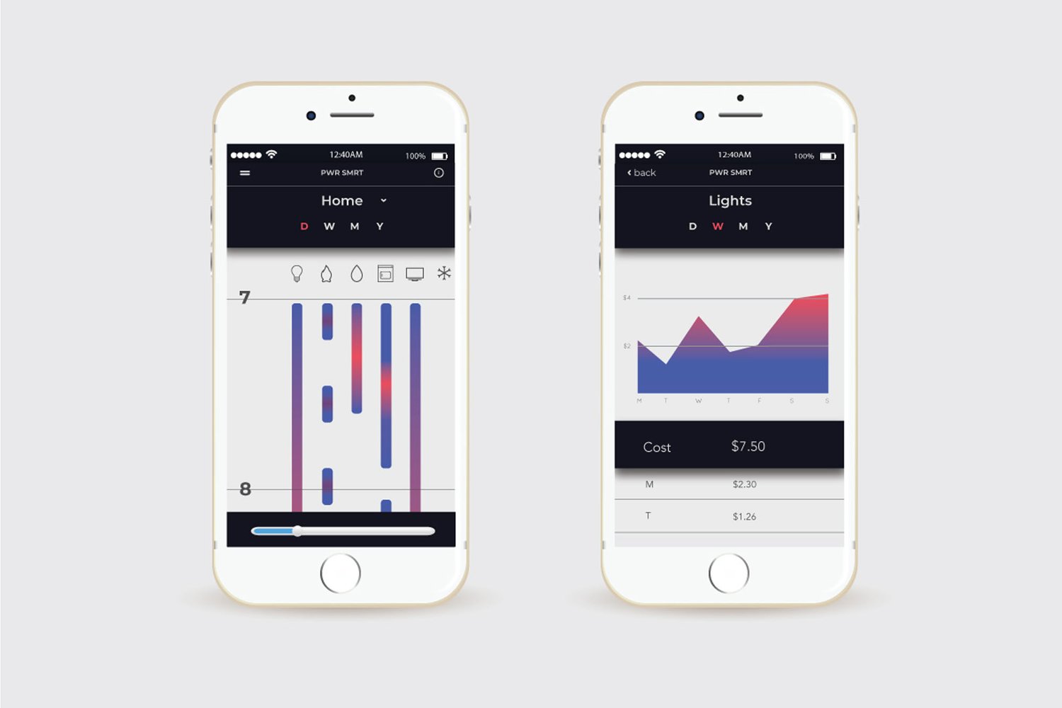
This product is a monitoring device of energy usage in your home. The smart device attaches to the home’s circuit board and tracks all instances of electricity being used as well as “phantom energy” to help the users locate where they use energy and how they can lower their hydro bills. The companion application tracks the overall energy use of the house, the use of each major appliance, location in the house that uses the most energy and the cost. The application achieves its goals by providing a unique visualization that allows users to see where most of their energy consumption is coming from without overwhelming them with too many numbers.

The graph works by creating a plot point as soon as an appliance is turned on and then stops when the appliance turns off. The saturation refers to the amount of kilowatts used with magenta representing heavy consumption and blue representing light consumption. Users can use the slider at the bottom to adjust the size of the data over time, and also choose to view the data by day, week, month and year to get a different view of their energy consumption. The icons of each appliance can be selected to view an in depth breakdown of its energy usage and cost. Users will now be able to see where there energy is being used, for how long, and how much energy is consumed. This can encourage them to make minor adjustments within the home to lower costs.

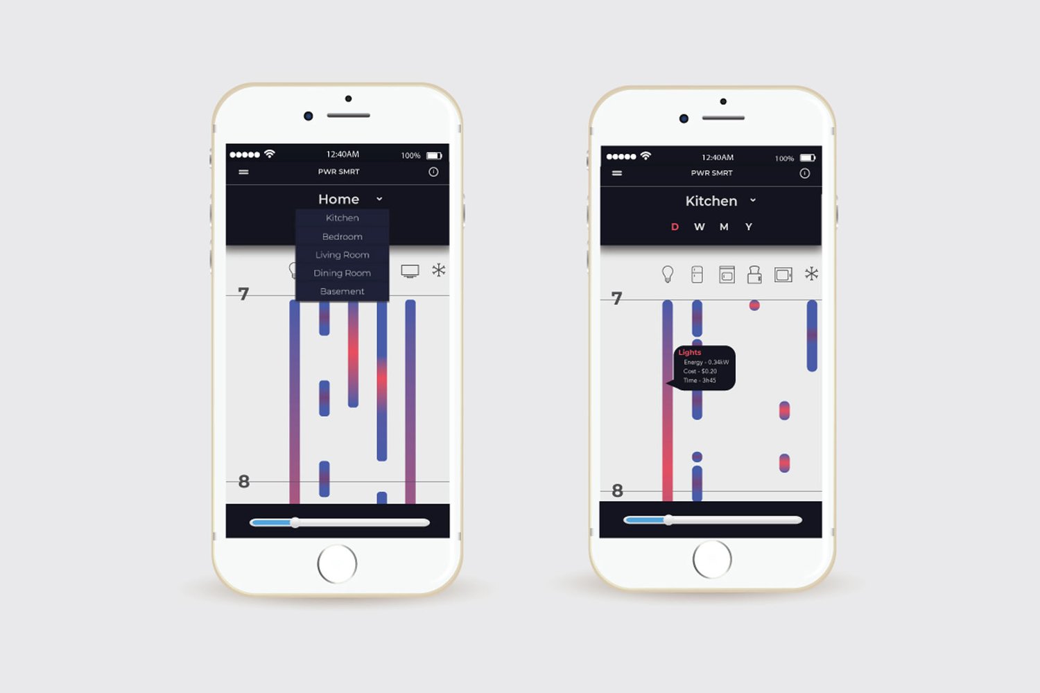
Users can iterate through the different rooms in their home by using the drop down menu, which provides an in depth breakdown of each appliance. By clicking on a data point, users can also see how long the device was on, and how much energy and money it has cost.

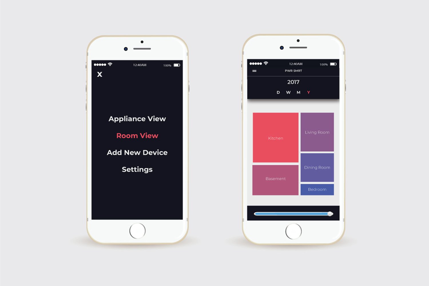
Users can also get an overview of their entire home, and which rooms are problem areas by using Room View found in the navigation bar. The data is displayed as a tree map for a quick understanding of the data.