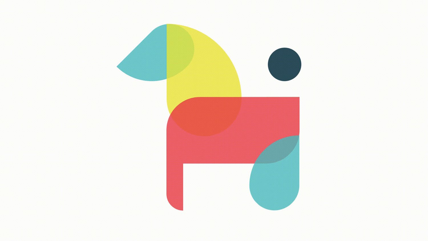
Muttual
Brand Identity

Muttual is a community focused group at the core that fosters local and symbiotic relationships. Through facilitating dog walking services, this company makes matches within a network of dogs owners and walkers to culture a trusting and supportive neighbourhood collective.
The name Muttual plays off the canine subject and the company interest in mutual benefit.
The logo exists as a word mark, icon or combination of the two. It can be truncated or expanded through three versions, the short form, long form, and addition of the slogan. The roots of the icon comes in multiple variations where the same shapes are rotated/rearranged to depict a variety of dog breeds for acknowledging diversity. There are generally 4 shape types that derive from square and circle units. The logical make up behind these forms make for a recognizable visual language.
Developing a flexible visual language allows interaction with the brand. By offering a toolbox of shapes and guidelines about how to position them, Muttual encourages creativity and invites the user to be a piece of the Muttual community rather just a user.
A comprehensive look into the brand, it’s identity system and application can be found in the Muttual Brand Guidelines Book. View it on issuu here.