Habitat for Humanity Canada – Identity Redesign
Brand Identity
The Problem
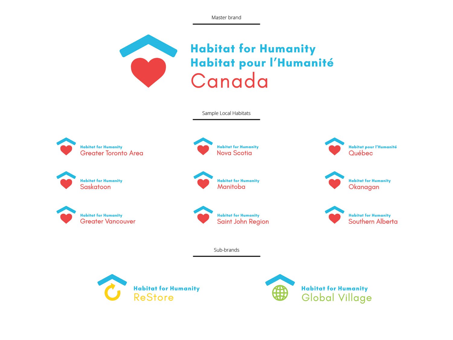
Though a widely known organization, Habitat for Humanity Canada had fallen behind in the competitive nonprofit sector. Internal research found that while the name held equity, much of the public were unfamiliar with their mission and services. Depending on corporate and private donations and the active involvement of volunteers in homebuilding projects, Habitat needed to pull together its widely dispersed local affiliates and sub-brands to present a strong, unified and mobilized organization. Their former identity had been misconstrued across their extensive brand architecture, further implying organizational disharmony. The goals of this project would be to create an updated, more energetic identity that clearly projects the charity’s mission and active nature, while creating a system that easily enables application across the many local Habitats and multiple sub-brands.
The Solution
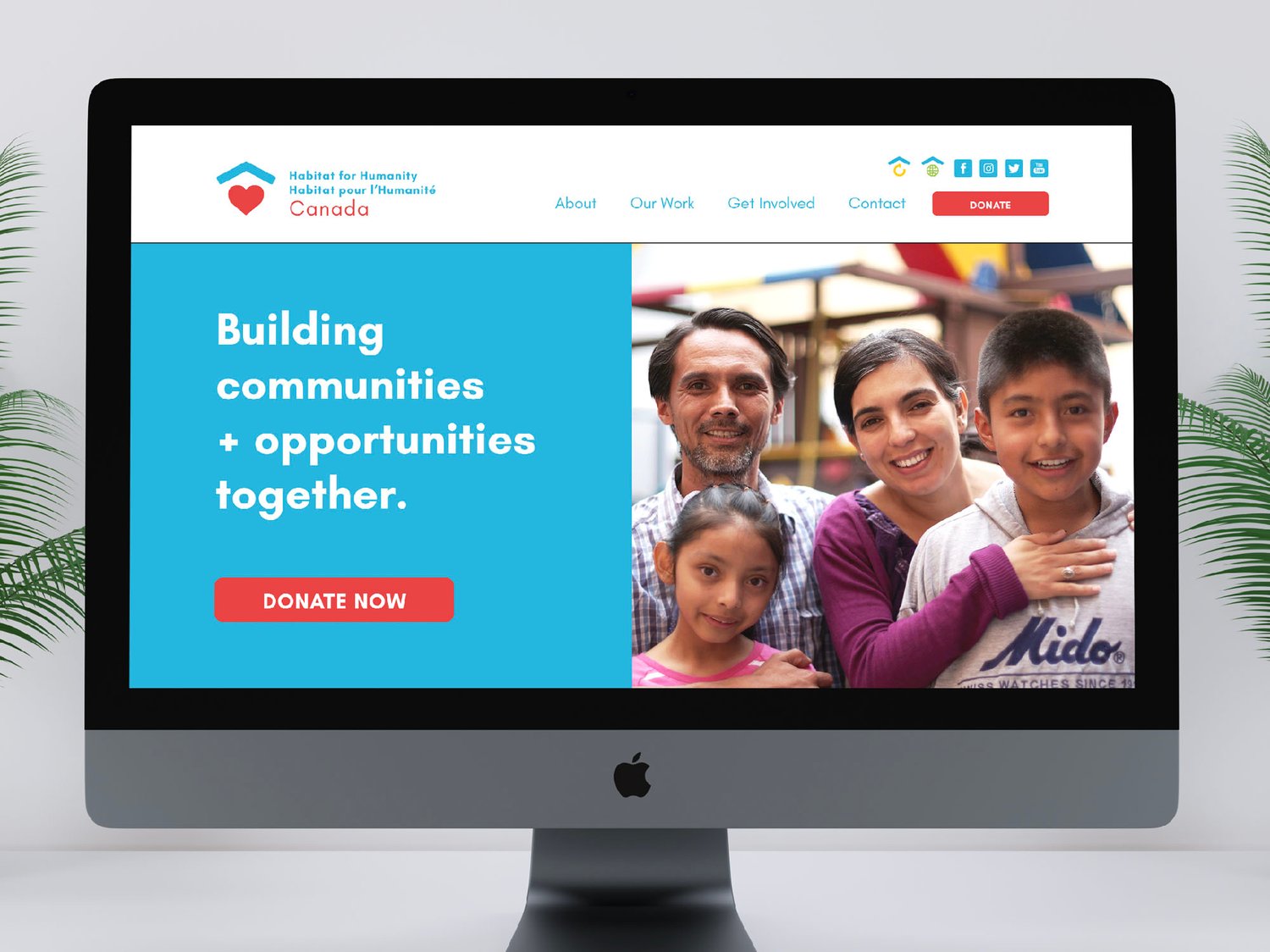
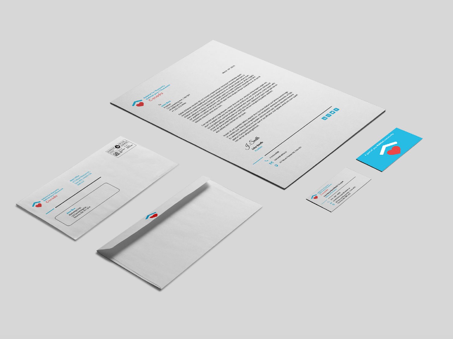
The new graphic identity for Habitat for Humanity Canada presents the master brand and its many subsidiaries as the strong and cohesive family they are, built upon the same values and mission. It is a product of the same values upon which Habitat for Humanity Canada operates. They are a community of affiliates, partnering families, volunteers, donors and corporate sponsors, unified in their vision of a world where everyone is blessed with the opportunities that stem from a safe and supportive home.
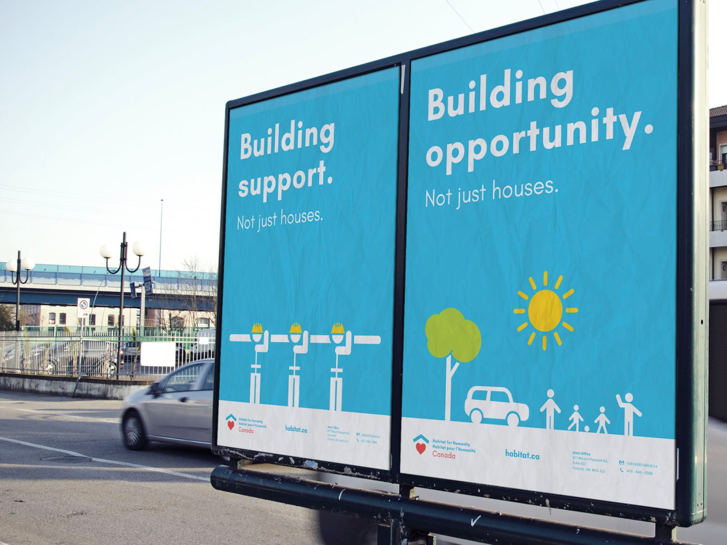
Their mission and values of support, community and opportunity, drive the bright and friendly new system. In the new logo, the heart is a ‘supportive’ element to the rooftop, sitting at its foundation. It represents the love of ‘community’ that is built into every Habitat home. The rooftop also forms an upward facing arrow, representing the ‘opportunities’ that come from partnering, volunteering or any involvement with Habitat. The iconographic and typographic system created easily allows affiliate sub-brands to showcase their own unique mission while undoubtably belonging to the Habitat family.
