Whole Foods-Rebranding
Brand Identity
Typography
Product Design
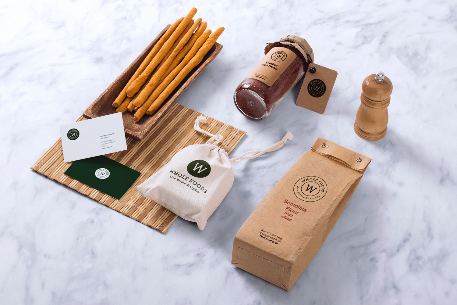
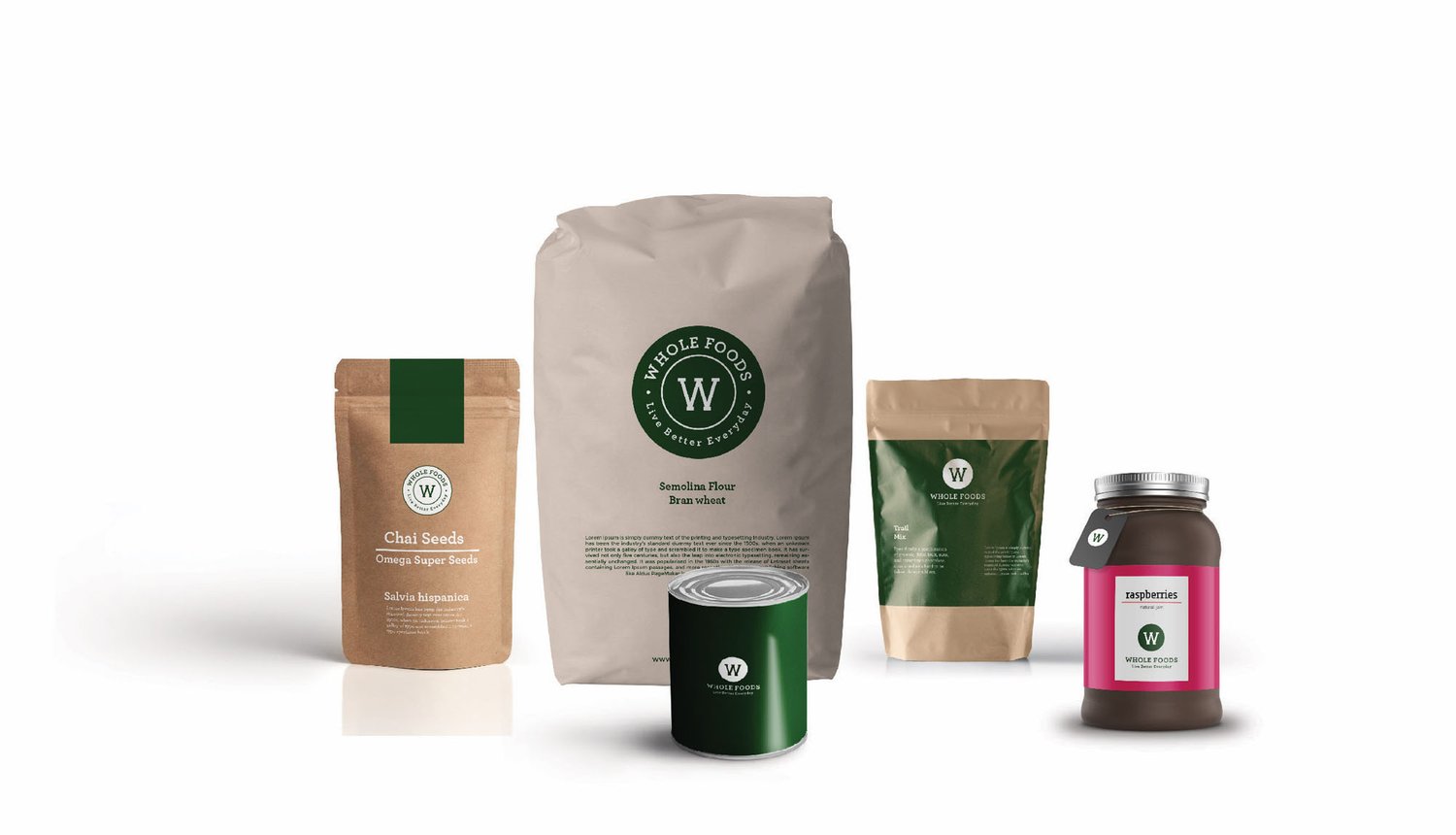
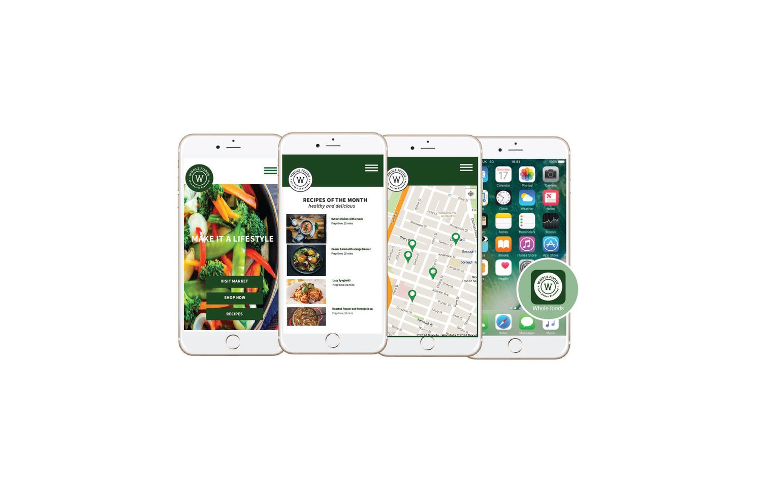
When I began to rebrand Whole Foods, I looked at one of the major factor that products will use Amazon’s infrastructure by offering high quality food at competitive prices at customer’s doorstep. The organization highly values sustainability, and health and nutrition. Business and growth is always the priority of the Whole Foods. They support many positive values and take part in many active cultures and I wanted to emphasize and implement these qualities to more extent through rebranding. I wanted to build an identity more interconnected, consistent, meaningful, and accessible branding.
In the beginning, I began to allocate some new essence of words to the brand that would become an important part of rebranding. Healthy, Accessible and Individual. The next step was to select a new tagline that would become an interesting theme “Live Better Everyday” this would be a powerful introduction of the idea of prioritizes your health and focus on creating lifestyle.
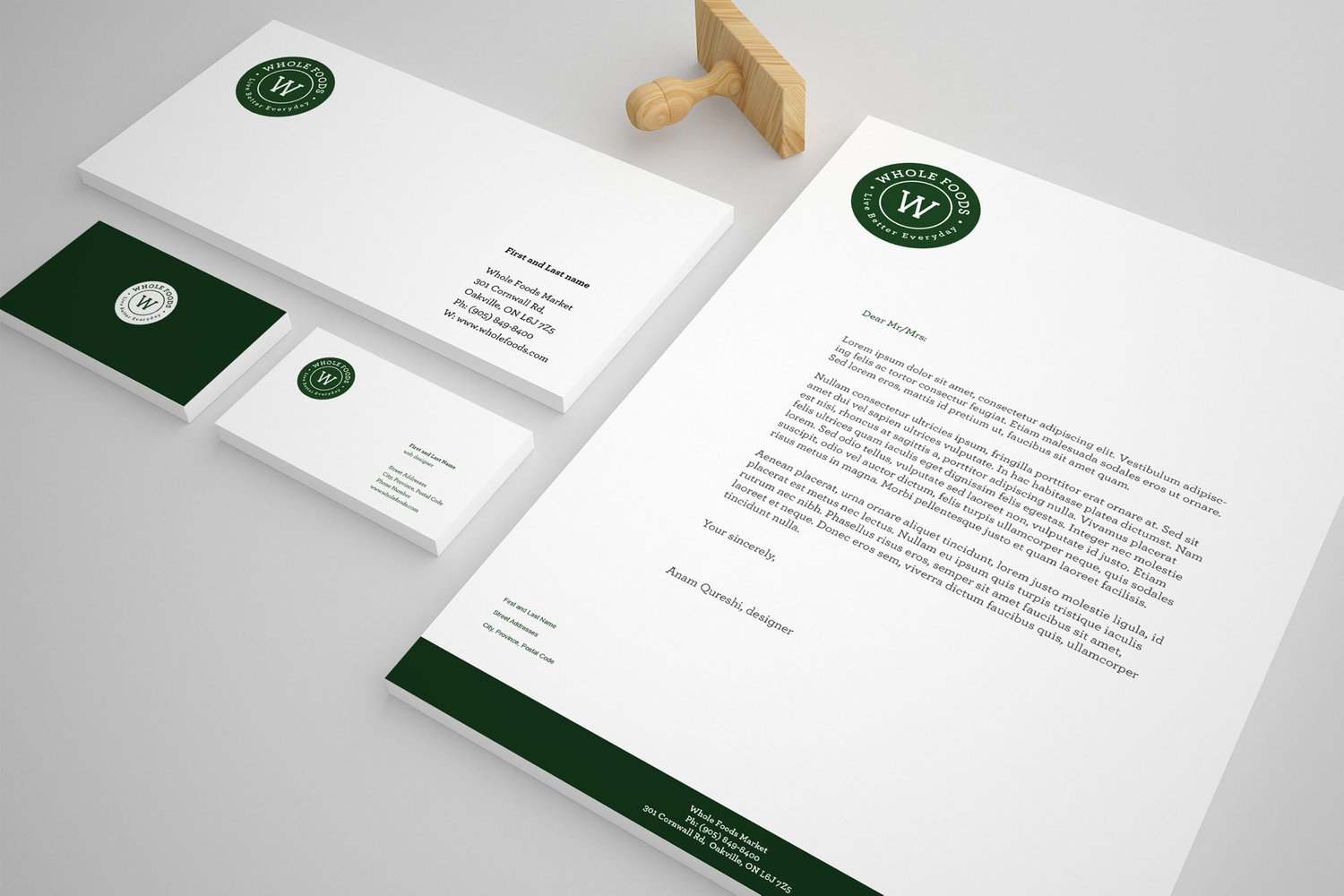
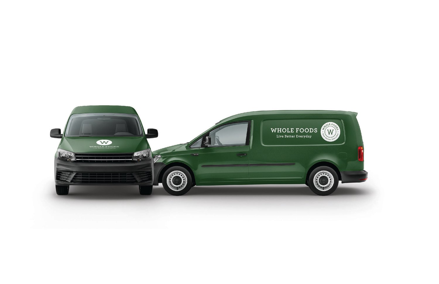
While designing a new identity of Whole Foods, I want to represent the natural and welcoming persona. Dark bottle green was the signature choice to represent the company as a whole for what they represent and relate with easily. I wanted to keep the colors natural and organic related which helps to maintain the essence of bright and rich identity similar to their products. Green can help enhance vision, stability and endurance. The dark green color has a healing power to understand their consumers to trust this new identity.
