Romelia
Typography
Romelia, A Typeface for Reading Comprehension
Introduction
Many students and adults have problems comprehending what they read. Although issues with comprehending what is being read can be caused by the reader’s past experiences and abilities, and not necessarily the typeface alone, creating a typeface that works best at certain font sizes and line lengths while enhancing readability and legibility, can overall shape the comprehension of the reader.
Using research taken from studies on reading comprehension, analyzing some of the most readable and legible typefaces, as well as taking into account personal experiences with lack of information retention, Romelia was developed to aid in reading comprehension when used in large amounts of body copy.
The Typeface
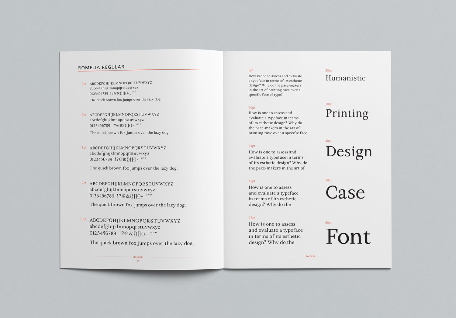
Romelia, a smooth and elegant old style serif typeface is designed to enhance reading comprehension for all ages and eye sight condition. Intended for use at 9-13pt, Romelia is meant for text within print mediums such as books, or longer bodies of text that need to be memorized.

Why It Works
Romelia’s characteristics are inspired by some of the most readible typefaces such as Adobe Garamond, Adobe Caslon, and Baskerville. Their short and bracketed serifs, open counters, large x-height, and long ascenders and descenders, enhance readability and legibility by creating a natural rhythm when leading from one letter to the next, which overall shapes the comprehension of the text being read.
For best results, Romelia should have a leading of 120-130% of the font size being used and an average line length of 50-60 characters.
Key Features
X-HEIGHT
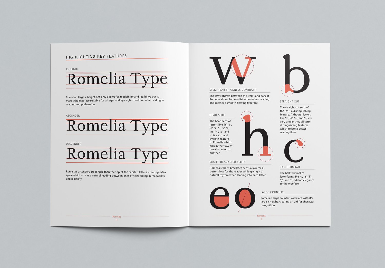
Romelia’s large x-height not only allows for readability and legibility, but it makes the typeface suitable for all ages and eye sight condition when aiding in reading comprehension.
ASCENDERS
Romelia’s ascenders are longer than the top of the capitals letters. This creates extra space which acts as natural leading between lines of text and aids in readability and legibility.

STEMS & BARS
The low contrast between the stems and bars of Romelia allows for less distraction when reading and creates a smooth flowing typeface.
HEAD SERIF
The head serif of letters like ‘h’, ‘b’, ‘d’, ‘i’, ‘j’, ‘k’, ‘l’, ‘m’, ‘n’, ‘p’, and ‘r’ is a soft and smooth feature of Romelia which aids in the flow of one character to another.
SHORT, BRACKETED SERIFS
Romelia’s short, bracketed serifs allow for a better flow for the reader while giving it a natural rhythm when leading into each letter.
STRAIGHT CUT
The straight cut serif of the ‘b’ is a distinguishing feature. Although letters like ‘b’, ‘d’, ‘p’, and ‘q’ are very similar they all carry distinguishing features which create a better reading flow.
BALL TERMINAL
The ball terminal of letterforms like ‘c’, ‘a’, ‘f’, ‘g’, and ‘r’, add an elegance to the typeface.
LARGE COUNTERS
Romelia’s large counters correlate with it’s large x-height, creating an aid for character recognition.
Comparison

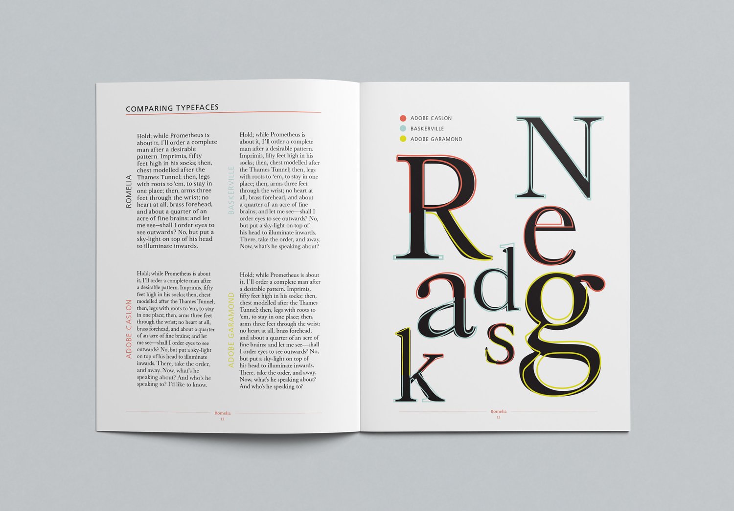
When comparing Romelia to Adobe Garamond, Adobe Caslon, and Baskerville, you can see Romelia takes on a larger x-height than the others. This large x-height is to accommodate all ages and eyesight conditions, as body copy in books can be very small and hard to read for younger or older readers. When looking closely at each letterform, there are very prominent similarities with Adobe Garamond, Adobe Caslon, and Baskerville. During research, these body copy typefaces were studied; taking the best readability and legibility features from each one and combining them to create a hybrid typeface, Romelia.