Elinor Infant
Typography

About Elinor Infant
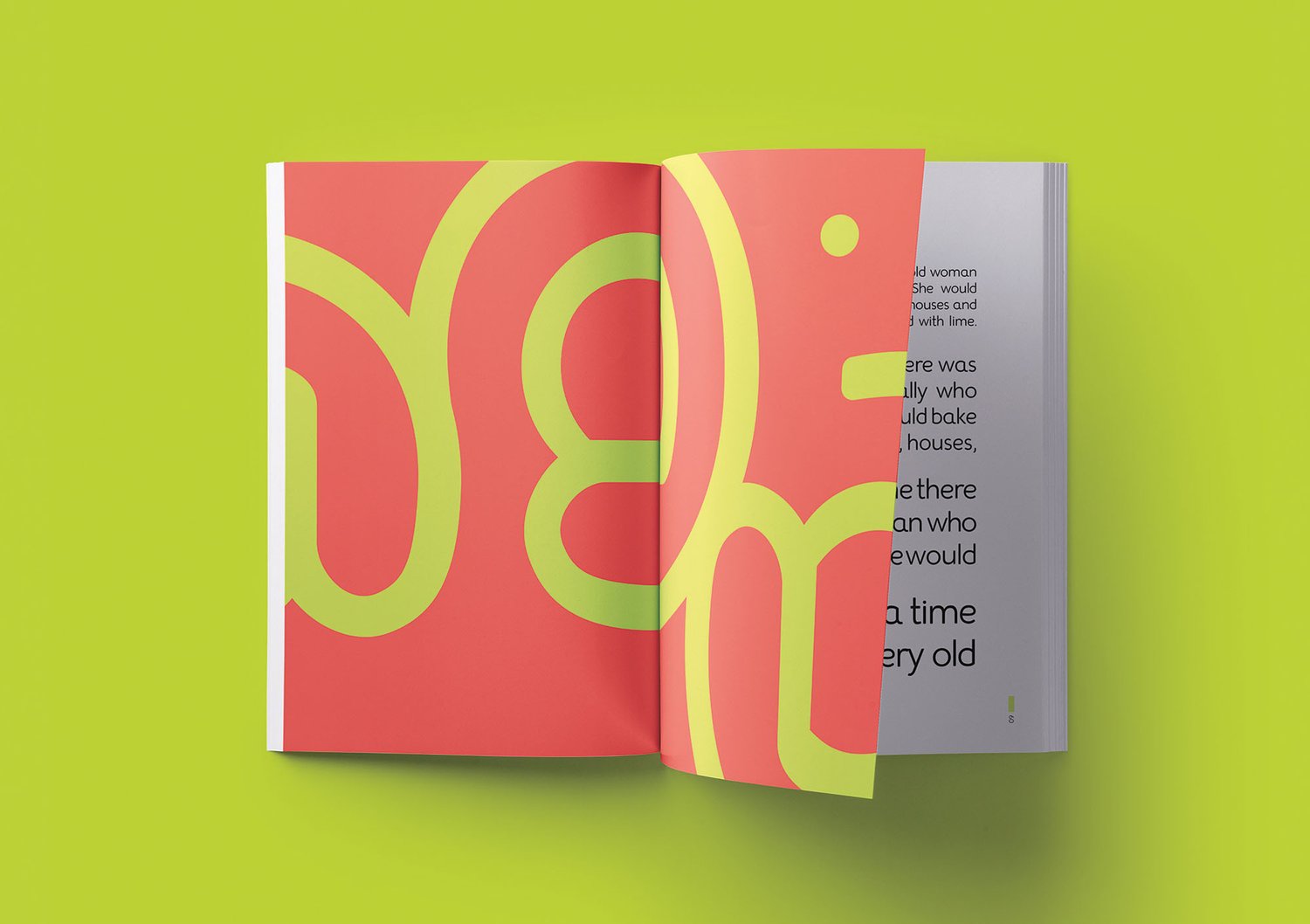
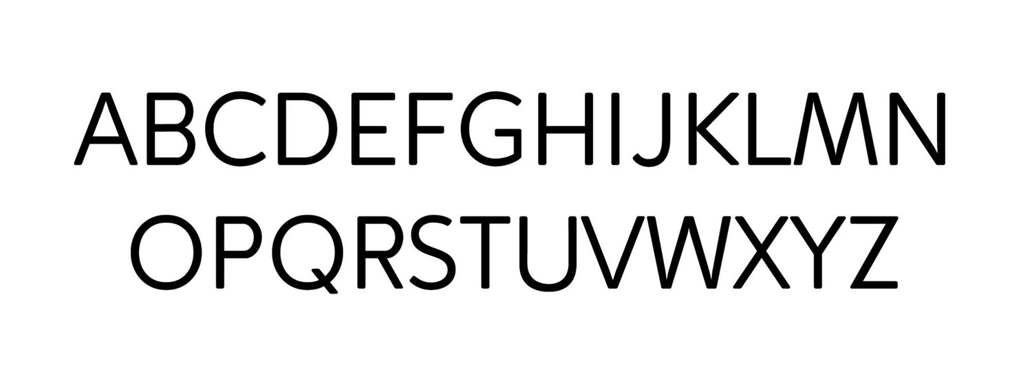
Elinor Infant is a friendly humanist typeface created for children learning to read and write. Its rounded terminals and open counters eliminate potential distractions, enhance character recognition and motivate children to engage with the learning process through a fun and interesting experience.

The Problem
When children learn to read and write, they make great efforts to understand every letter of the alphabet and the connection between letters and sounds. They first learn to recognize lowercase characters, then uppercase, then words and then sentences. During this process, many children tend to feel overwhelmed and discouraged, however, one can support them by providing them with inviting texts properly set in typefaces with good readability and legibility.
Young readers are able to fully discriminate small visual details like adults do. However, within their immature cognitive process, their memory and attention fluctuate; thus, a variation in the smallest details or quirks in shapes might trigger confusion. For this reason, the x-height, counter size, letter spacing and stroke width, as well as its presentation, in terms of size and colour, play a great role in the effectiveness of a font for a kid.

The Process
The design process to create Elinor Infant involved a deep research about the learning process, an analysis of existing typefaces, and the study of every letterform on the alphabet; to ultimately understand the anatomy of each character and simplify it for children.
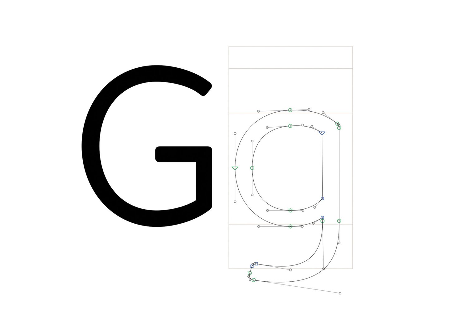
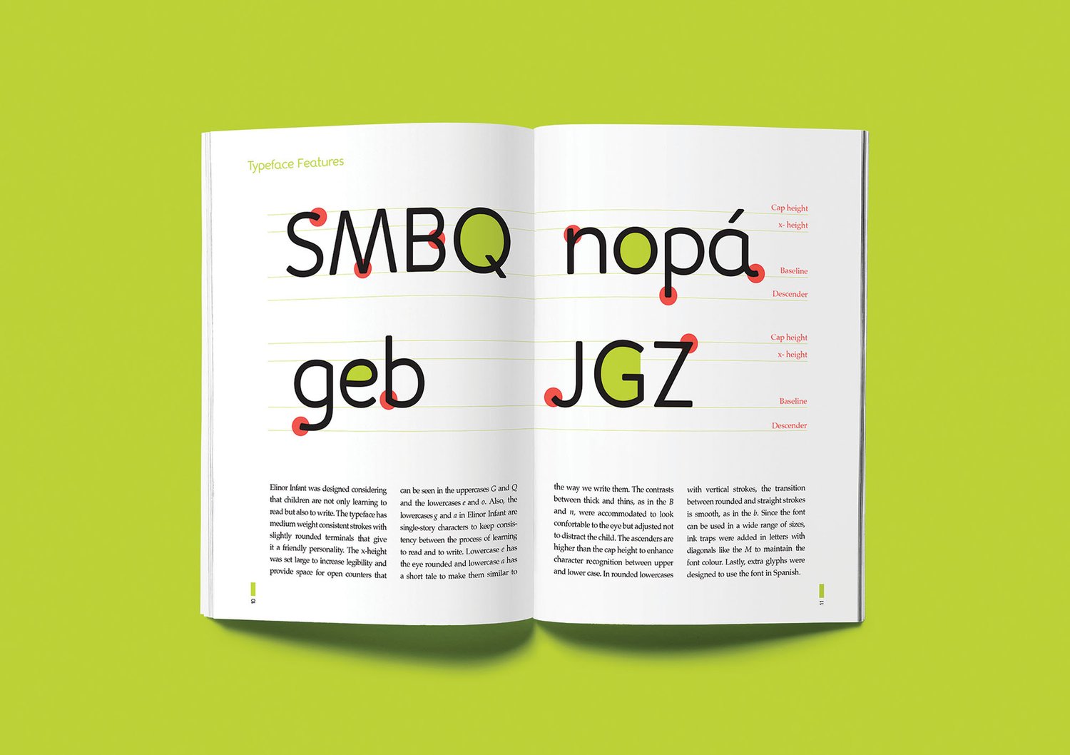
To reduce potential distraction, medium weight consistent strokes with slightly rounded terminals were carried through all the characters. The x-height was set large to increase legibility and provide space for open counters. The contrast between the thick and thins was accommodated to look comfortable to the eye but adjusted not to distract the child. Ink traps were added in letters with diagonals to maintain the font colour in multiple sizes. The ascenders were designed to be higher than the cap height to enhance character recognition between upper and lower case. All characters were designed as single-story to avoid confusion.

The Solution
This sans serif font with humanist features is an easy-to-read typeface with good readability and legibility for children. Elinor Infant manages to keep the young reader’s attention for a long time through a constant stroke weight; it’s simple shapes and smooth curves let children understand the letters’ structure to effectively learn how to read them and write them.
Elinor Infant was designed as a display typeface for preschool classrooms and textbooks with short line length. It should be featured as the first typeface that kids will encounter, Elinor Infant invites children to read through a warm, friendly and well-designed typeface for them.