Art Basel Promotion Campaign
Communication Design
Brand Identity
Package Design
Art Basel is an annual international art festival originating in Switzerland, taking place in Basel, Miami Beach, and Hong Kong. Each show works in collaboration with the host city and its local institutions, and drawing tens of thousands of visitors to each show every year, including art directors, curators, private collectors, spectators, and students. Well-established in the sphere of arts, the exhibition is not a museum, but instead strives to challenge what contemporary art can be and what it means. Art Basel’s intent is to showcase and sell works to said parties. The show namely exhibits modern and contemporary works of art from hundreds of international galleries and collectors, as well as new and emerging artists.
Apart from being one of the world’s most exclusive art fairs, the event also operates as a social event for celebrities and the cultural elite. This serves as an opportunity for brands to host art-inspired events for their highest paying customers, as well as mark their presence among the world’s elite and the exhibition’s visitors. Art Basel is in itself a platform for business, whether it is for buying and selling art, or promoting one’s brand.
However, the branding for the art show and its website and promotional pieces appear somewhat austere and corporate. This might make sense from the art business side of things, but it really falls flat when it comes to encapsulating the show that raises eyebrows every year. Their design lies in stark contrast to the glamorous and glitzy media coverage on Art Basel you see on television every year. This seems to create a dissonance between how the public see the show and how its benefactors see the show. This problem is worth solving because as Art Basel is is an art show that pushes the boundaries of the definition of art and challenges what it means to be an artist, their website and promotional materials.
I often find myself inspired through popular culture; the concept of “popular culture” is an ever-in-flux societal response to the current times. I see it as a valuable resource that can be used to more accurately craft messages and design that resonate in the context of its current time. This led me to play with the idea of using and subverting popular culture and pop art, two things that some may consider synonymous with Art Basel. I began to research pop art, and its relationship with Art Basel.
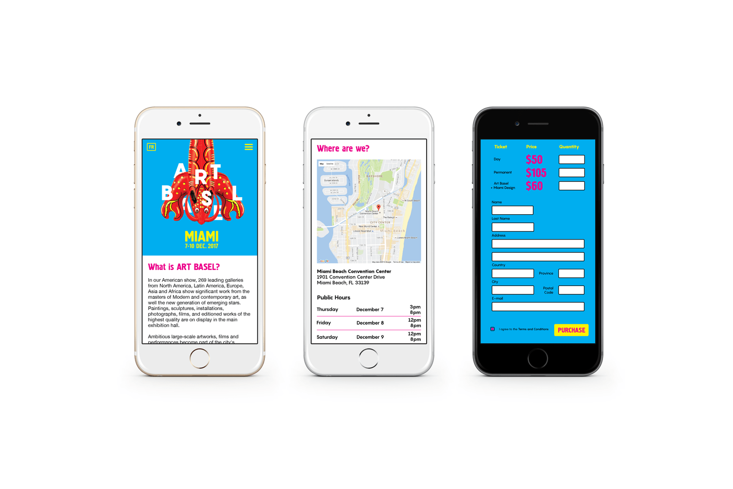
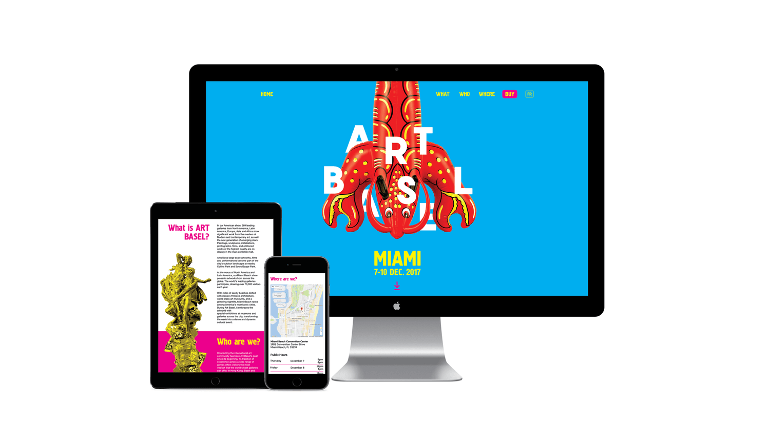
One of the biggest challenges I’ve encountered along the way is coming up with a system that integrates pop art across all three deliverable components (posters, homepage, and pamphlet) in a way that does not subtract from the Art Basel’s point of view, but rather compliments it in a way that does not seem neither corporate nor juvenile, but rather playful, elegant, and vibrant. I overcame this challenge by letting the show and its location speak for itself through my approach. Specifically, I let myself find inspiration from the host city of Miami and its surrounding area. Miami is a bold, vibrant city known for its parties and beaches, in a state that is iconic for its swamps, alligators, and flamingos.
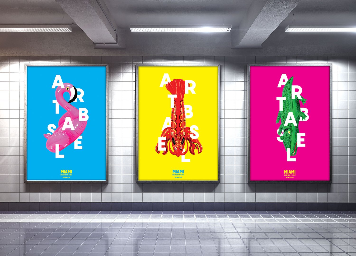
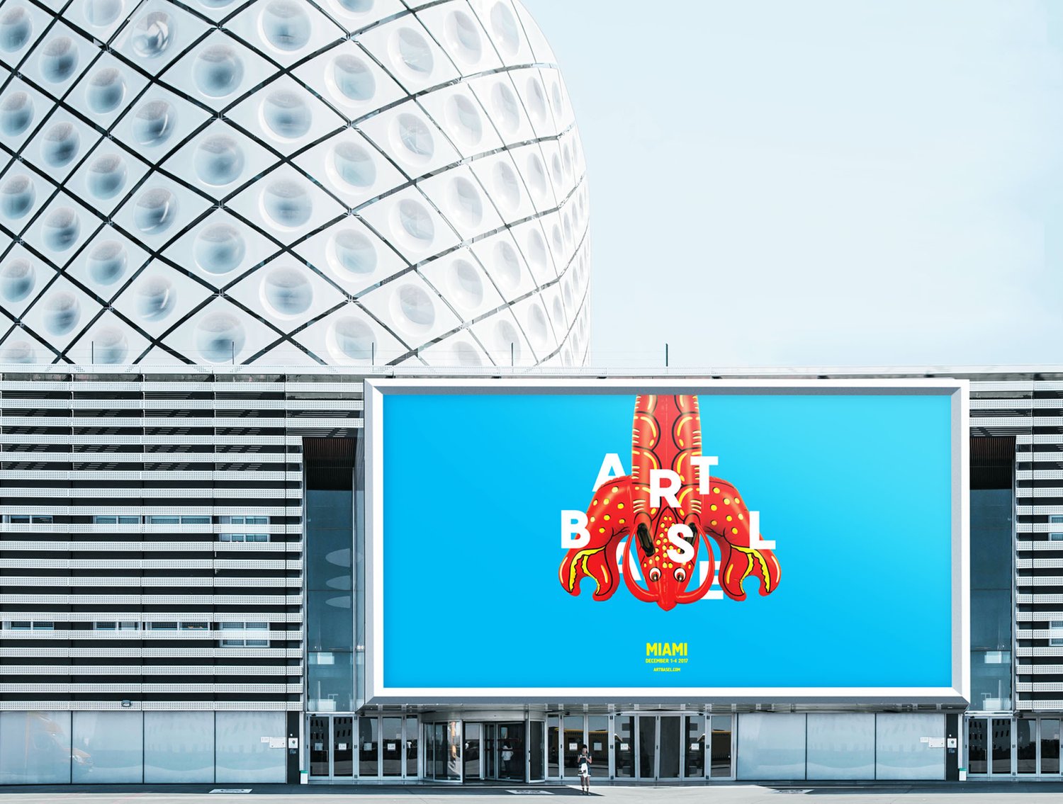
Art Basel Miami is an art show known for its contemporary and sometimes controversial works, often admired or criticized for, in some cases, mundane objects and works being presented as art. Although the modern art world would like to reject such thinking, what would it mean to instead embrace it? Upon discovering Art Basel regular Jeff Koons’ Lobster, an aluminum sculpture made to look like a pool toy, I found that this singular work was an illustrious representation of Art Basel, Miami, and contemporary art in itself. I paired Koons’ Lobster with generic, inflatable pool toys in the shapes of a flamingo and alligator, that were not considered art and could instead be purchased at a local department store. In doing so, I elevate the everyday pool toys to symbols of high art representing the essence of Art Basel as well as the city of Miami, Florida; a triptych of land, air, and sea. Through the subversion of popular art and inflatable swimming accessories and the use of bold colours (such as the Art Basel pink, blue for the sky and ocean, and yellow for warmth and vibrancy), I brought Art Basel closer to the reality of its show while also letting its location inform the the brand’s themes and aesthetics.
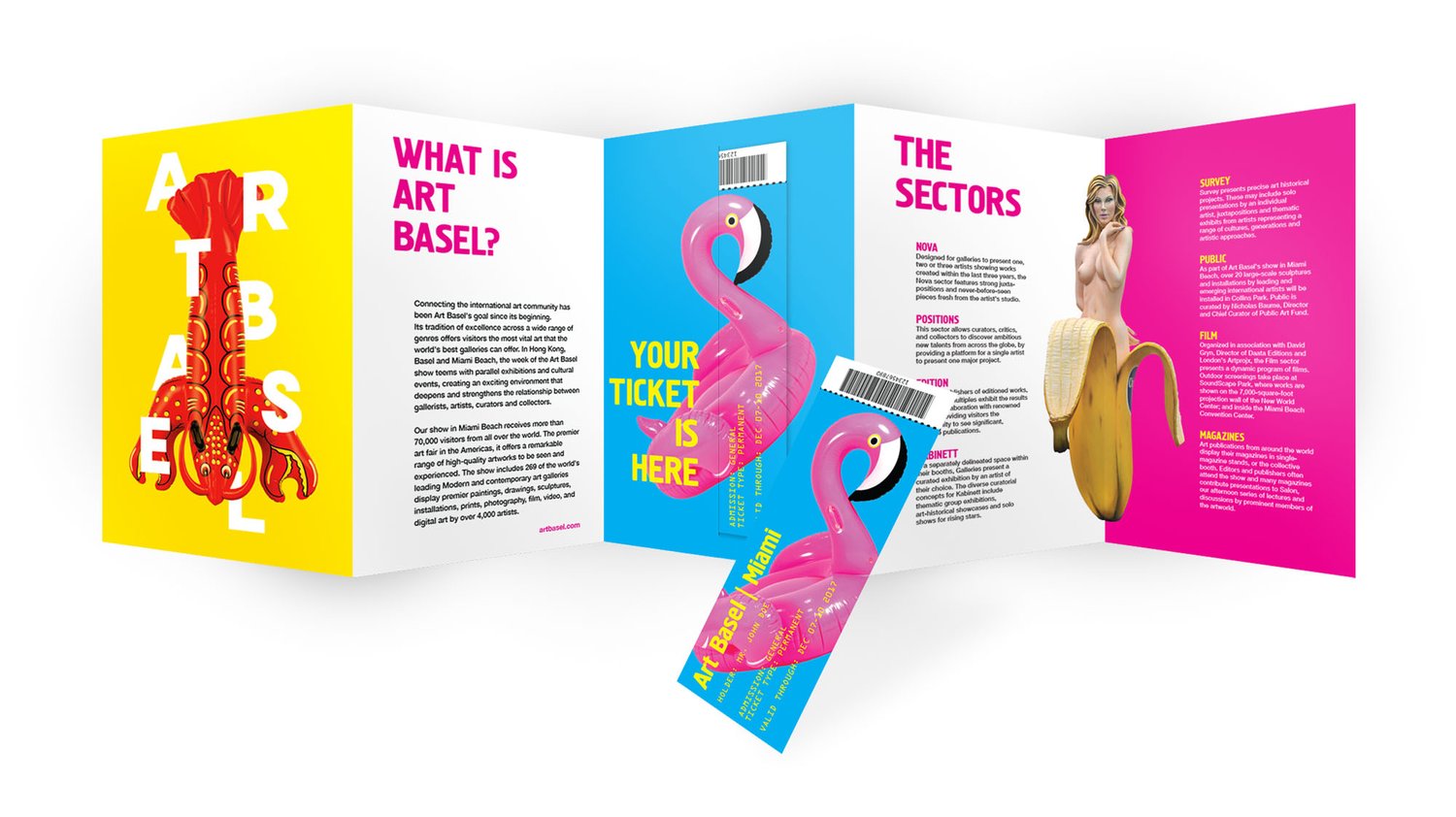
This Art Basel campaign embodies both the contemporary art found at the exhibition and the city of Miami’s vibrancy, targeted at artists and their respective audiences and prospective buyers.