Natural Balance Repackage
Package Design
Brand Identity
Natural Balance is not falling too behind when it comes to innovation as they have all the right, healthy ingredients in their foods, they have many options for people to be able to rotate through different flavours, and they have limited ingredient formulas as well as formulas with many different protein options in one. They have reduced calorie recipes, weight management recipes and ultra health recipes. They also target owners of “small breed” and “large breed” dogs with all of their recipes, by giving them the option to buy for the kibble size depending on their dog.
Yet, the design of their products next to a lot of their competitors is completely lost, and the only reason they’re still going is because of the brands history and reputation for healthy, fully balanced dog food.
The design aspects of the original packaging I wanted to keep throughout my redesign was:
- Mountains 2. Whitespace 3. L.I.D 4. Logo 5. Name of Formula 6. Quality Seal
The three adjectives I chose to describe my repackage are healthy, independent, and natural. This company isn’t about the money, it’s about keeping the pet healthy and loved.

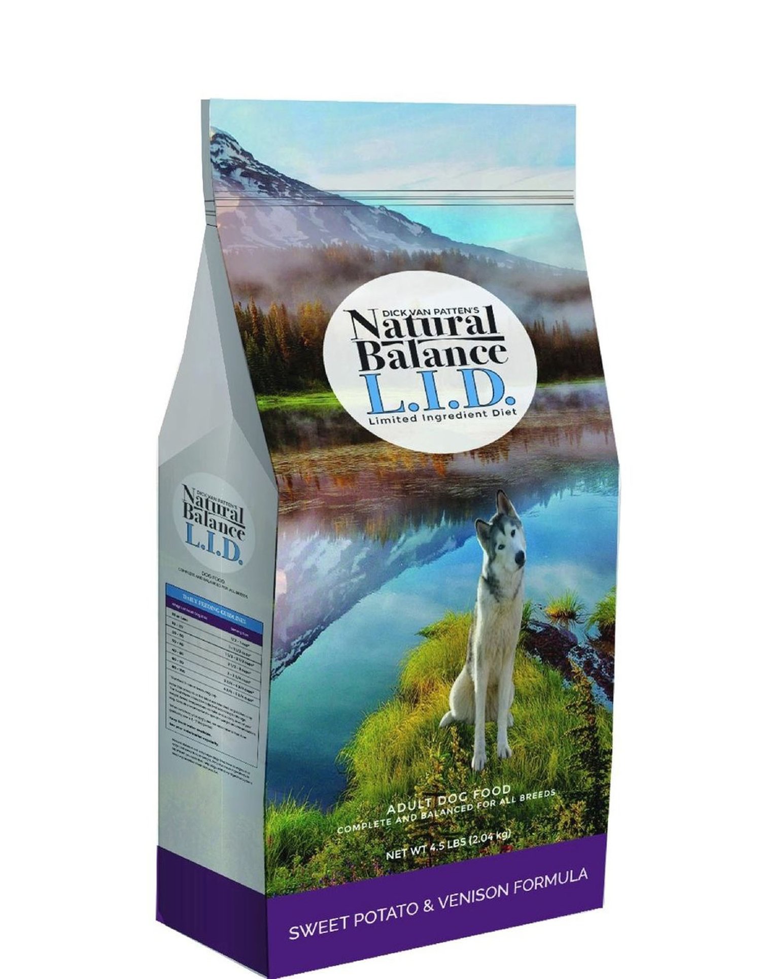
This concept kept the mountain scenery, a similar logo but touched up logo, and added a dog onto the front of the packaging. The dog was taken from the logo and added into the background scenery design. I made sure to get a happy, cute dog on the front to attract buyers.
This packaging has a zipper on the top to keep the food fresh, and has the formula name and colour the same as the incumbent package.

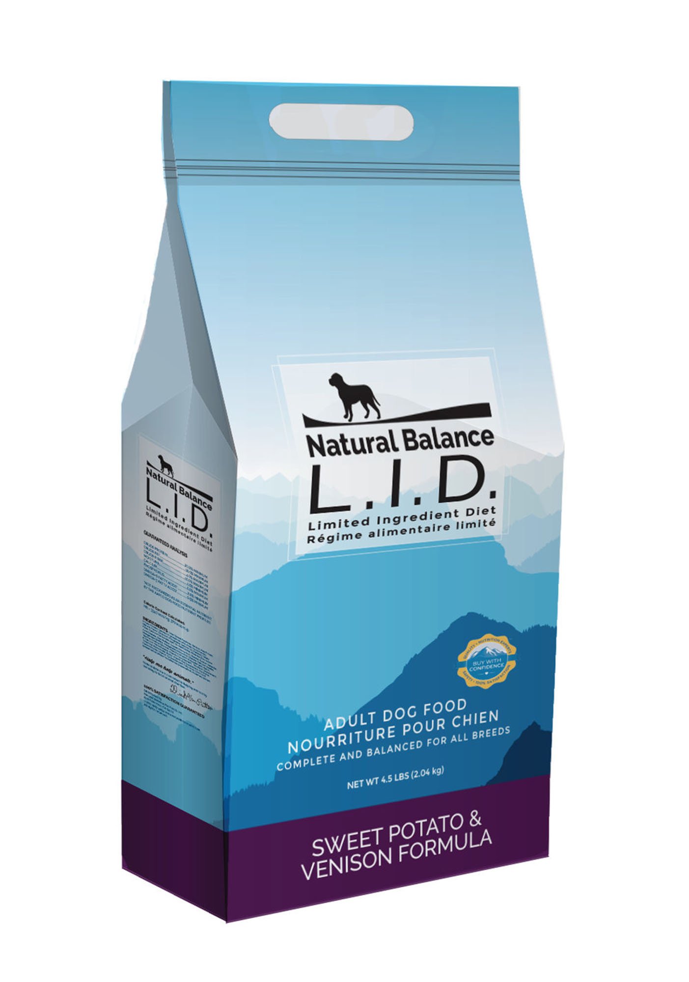
With this concept I experimented a little further. I kept the dog in the logo this time, while adding white space into the back of the logo. I added a similar line design as in the original logo; to resemble mountains with the dog standing on it.
A hole in the top is added as a handle for easier transport. The mountain scenery is continued as well, with the same formula name and colour.

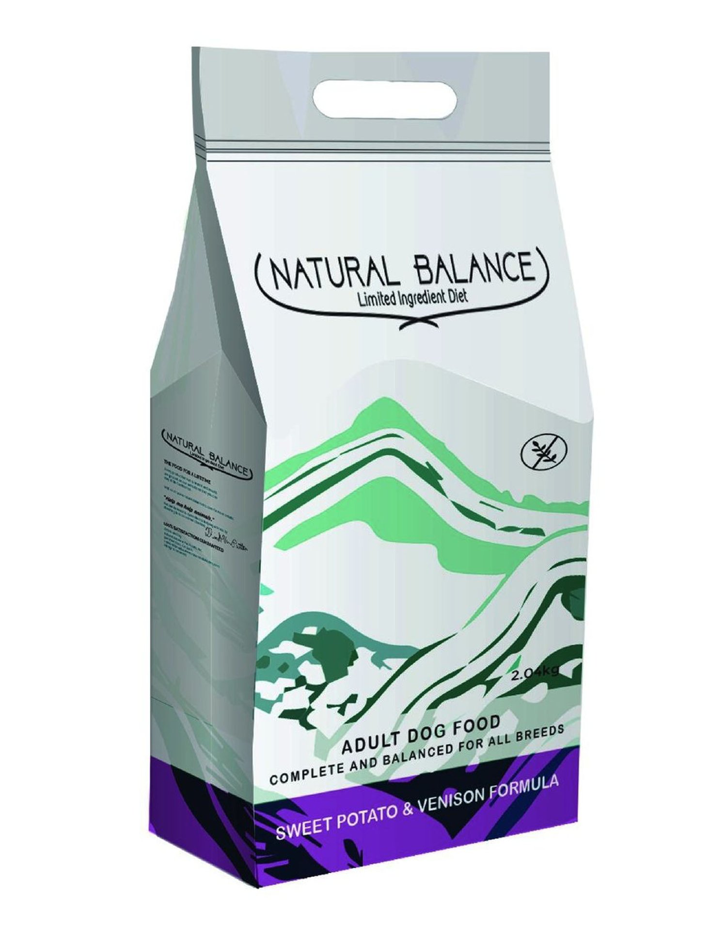
This concept went way further than the first two concepts. I wanted to transform this package to be more holistic and natural looking, while having the mountain design abstract. I added in a different logo design with the added effect of two lines connected to signify balance.
A grain free logo is also included, with the same formula name and colour as used throughout.