Female Eye Film Festival
Communication Design
Brand Identity
The Female Eye Film Festival is a festival that showcases films directed by women in order to offer a woman’s cinematic perspective. The main goal while creating the identity was to capture the empowering, vocal and honest nature of the festival, creating a space for women’s stories to be told. Traditional notions of femininity were avoided in order to appeal to a greater audience, instead of those who prescribe to gender stereotypes.
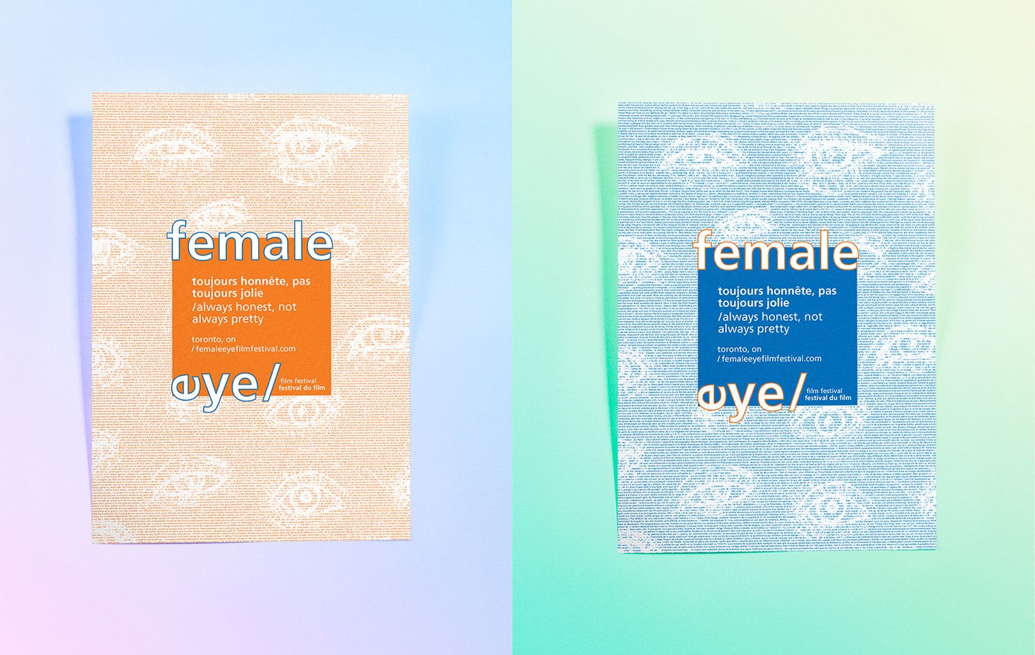
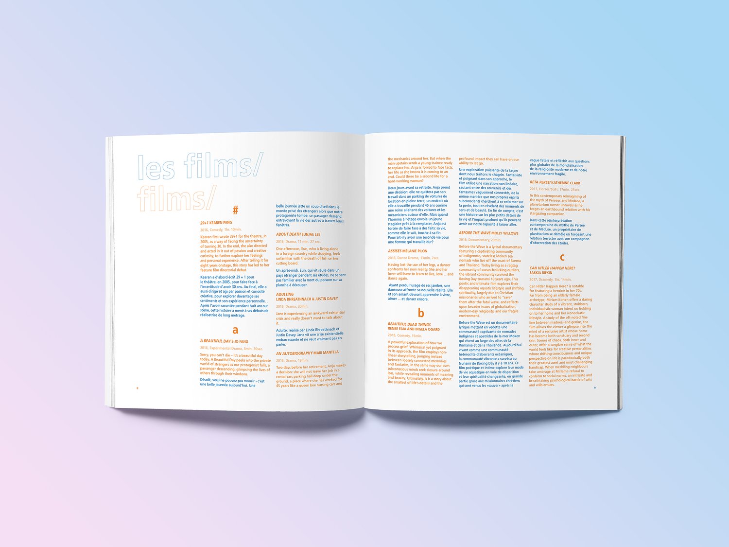
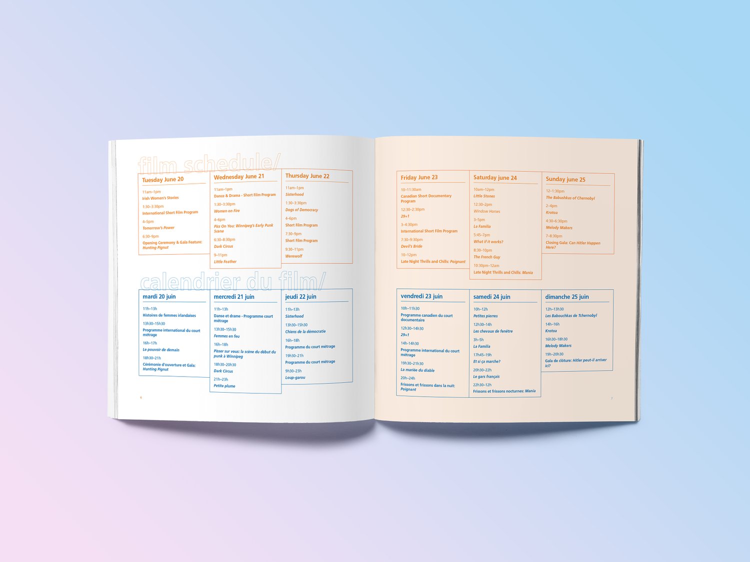
The festival poster was the central expression of the identity. The text flowing through the background, features all of the descriptions of the movies being featured, essentially paraphrasing the stories to be told. The main mark features a flipped “e”, representative of the flipped perspective, like the phrase “turning on its head.” The colour scheme is simple with two complimentary colours: orange and blue. They’re bold, demand attention, and also serve as a way to divide content that’s two different languages.


The two main components of the identity are currently a program and a poster, however more applications of the brand are in progress.
Female Eye Film Festival - Always honest, not always pretty.