Covenant House Brand Redesign
Brand Identity

About the brand’s redesign
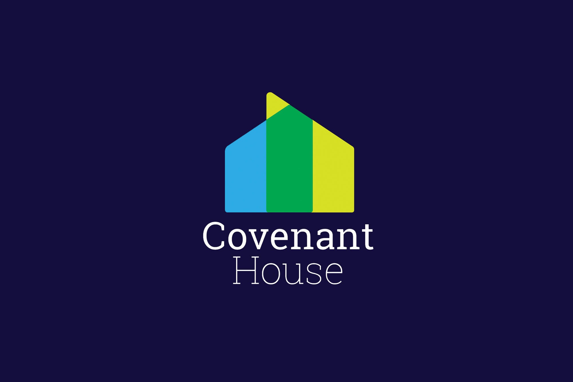
The Covenant House brand redesign presents the non-profit organization as an inclusive place of hope and opportunity for the homeless youth. Through a colour overlap, the new logo implies a moving-forward transition from the coldness of the streets to the bright future the youth achieves after leaving Covenant House.
The problem
Covenant House is the largest privately funded child care organization network in the Americas. With the help of volunteers and donors, the organization offers shelter, food, crisis care, healthcare, educational support, and skill training programs to ensure the youth a smooth transition into a successful adulthood.
Although the mission and values of the organization clearly state their intentions to communicate and help the youth no matter their race, sexual orientations or religion. The organization’s brand is highly outdated and it has a religious connotation. Thus, the redesign aims to present the brand as a contemporary, inviting, friendly, and inclusive organization.

The process
The design process included a deep research on the organization as well as the establishment of three essence words: resilience, opportunity and hope. As the brand concept was developed, the idea of representing the transition of the youth before, during and after being at Covenant House became an option that could positively communicate to both, the youth and the donors; thus, overlapping shapes with transparency levels soon became an appealing way to do so.

The Mark
The final mark implies a moving-forward direction through the single light green peak. It represents the organization as a friendly, warm and welcoming institution that offers more than shelter. Though an overlap and transparency, the mark tries to bring together the streets and Covenant House, while representing the change in the life of those that go to the organization.
Since the main goal is to warmly attract those in street-situation, corners were rounded to make the icon less intimidating. Since the non-profit works to benefit both female and male homeless youth, colours were carefully chosen to attract both genders while still communicating the organization’s mission and values as well as the three essence words.

The Style Manual
The manual clearly explains the correct usage of the logo, typography, colour palette, photography and language direction to ensure consistency and the integrity of our redesigned brand. Six brand applications were included as examples of how to use the brand properly. The intention of this extensive manual is to ensure that the brand is well-communicated in all media in all branches of the organization around the world. Properly applying the guidelines will make the brand recognizable among the homeless youth and donors over time.